Part 2: Personalization and Security
A previous blog post in this series introduced the Liferay dashboard framework that XTIVIA has developed as serviceware that is available for purchase by our Liferay implementation customers. This post will continue the discussion by describing how personalization and role-based security is applied in the framework.
In the data warehouse framework we have requirements for implementation of security and access control. Certain users are only permitted to view a selected subset of data in the data warehouse. So in the dashboard framework, a security layer has been added based on the user information to enforce data security and filtering. The security layer is added in the data feed service web plug-in.
The user information can come from many different ways for the security layer to use. In the following steps, we will add some extra user information using Liferay user expando service. The dashboard framework will fetch this piece of information of the current user, create some user specific filters and apply them when serving the data to the charts.
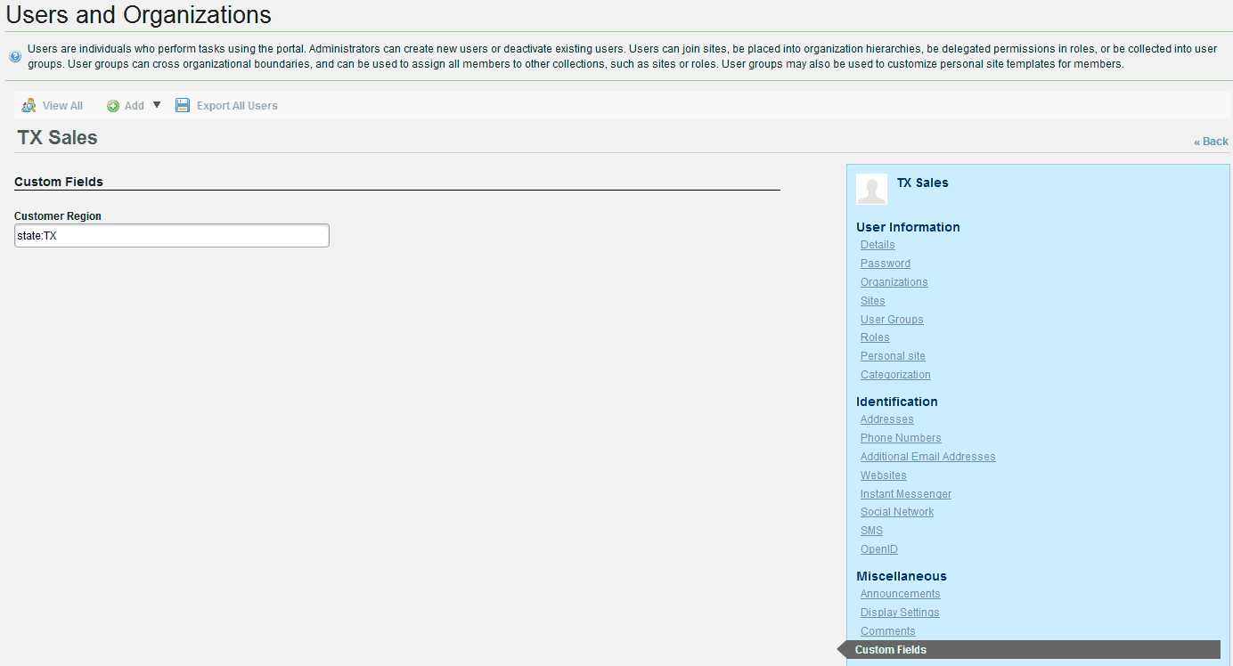
Let’s create a new custom field for Lifeary user first, go to control panel -> Portal section -> Custom fields -> click “Edit” link in “User” row and add a new custom field called “Customer Region” and leave the default “Text” field type. Then create a new user called “txsales” and set the custom field “Customer Region” to “state:TX” as below:
In the data feed service web plug-in, we need to add some customized code to utilize this user’s custom field to generate the user specific filters.
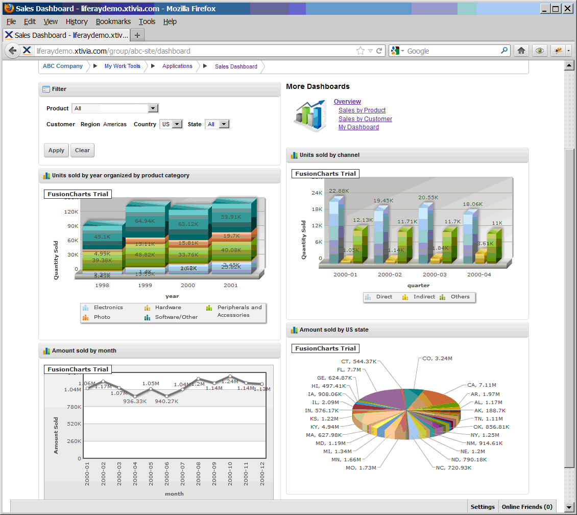
Do you still remember the question I mentioned in the last part of this blog: how to let different users see their personalized data in the charts on the same dashboard page? The answer is here we can add code in the security layer to generate different default filters for different users. After this piece of code is added, once the user “txsales” logs in, a default “state” filter with the value “TX” will be applied, so this user will see the dashboard page like this:
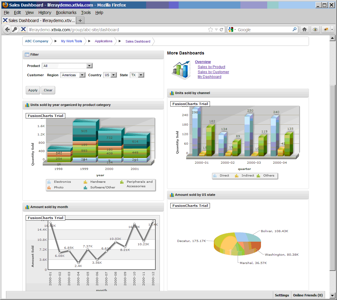
As what is shown in the screen shot, by default all the charts on the dashboard page are only showing the data for TX State.
To see the difference, we create another user called “ussales” and set the custom field “Customer Region” to “country:US”, when this user logs in, he will see the dashboard page like this:
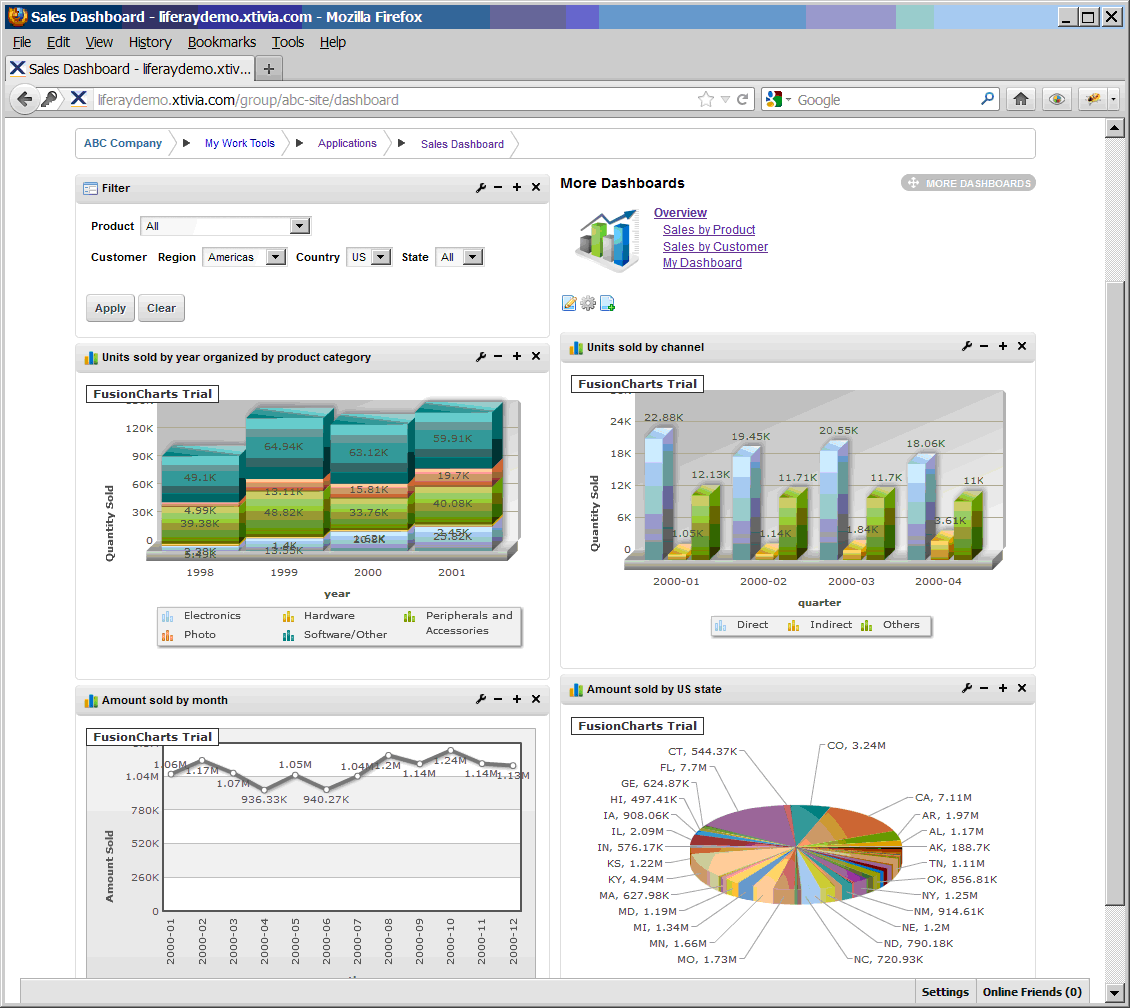
By default all the charts on the dashboard page are only showing the data for US. So now the user can get his personalized chart shown on the same dashboard page, and we don’t need to do any changes in the chart portlets or the filter portlet on the page.
But still the user can browse any scope of the data in the data warehouse by applying the filters in the filter portlet. We need to add some constraints to the user so that he/she can only see some scopes of the data in the data warehouse.
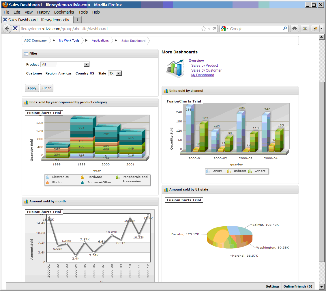
In this example, let’s suppose we have the business requirement like this: The TX state sales representative user can see the data in TX State and in all the other states in US; The US sales representative user can see the all the data in US and in all the other countries in Americas. By adding another piece of custom code in the security layer, we can generate more user specific filters based on the user information. Now once the user “txsales” logs in, he will not able to select other customer area in the filter portlet but only the states in US:
When the user “ussales” logs in, he can only choose other countries in region Americas, he is not able to see data in any other regions except Americas.
Now we have got an idea how the security layer applies to the dashboard framework and how it works.
The dashboard framework also provides some drill down functionalities. Let’s take a look at how we can add the drill down charts to the sample charts we configured in part 1 so that users can look into more details of the data shown on the charts.
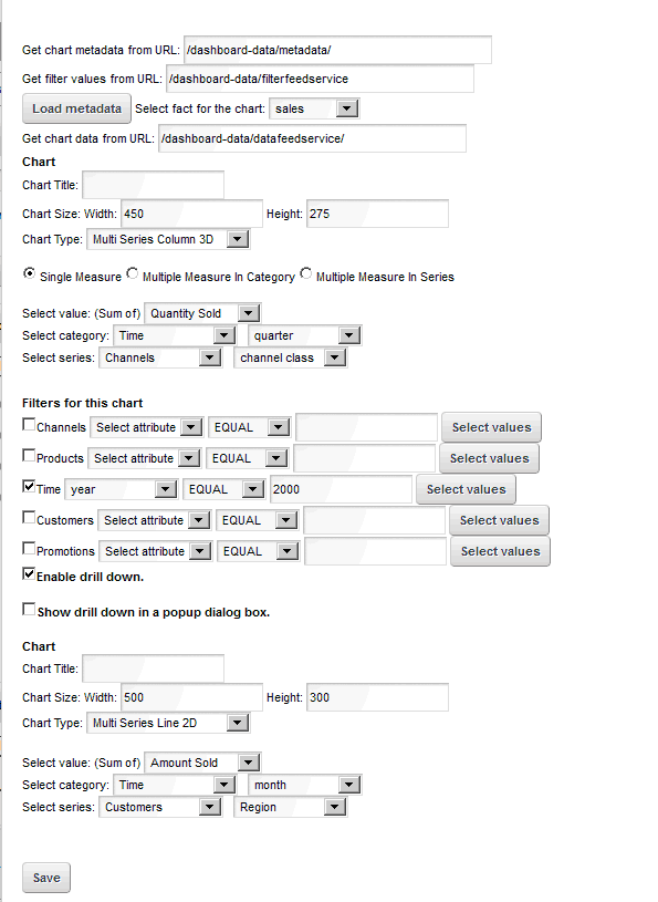
Sample chart 1 is “Units sold by channel” chart. Let’s open up the chart portlet configurations for this chart and check the checkbox in front of “Enable drill down”. The drill down chart configuration section will pop up. Choose the chart type to “Multi Series Line 2D”, the measure to “Amount Sold”, the chart category to “month” and the chart series to “customer region”. Here’s the configuration screen:
Once the settings are saved, the original chart will remain the same, but all the columns in the chart become clickable, when the user clicks the column, another chart with the monthly detailed data for that quarter will show in the same portlet window as below:
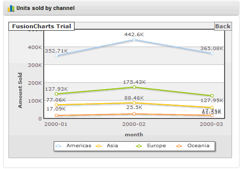
User can click “Back” to go back to the original chart.
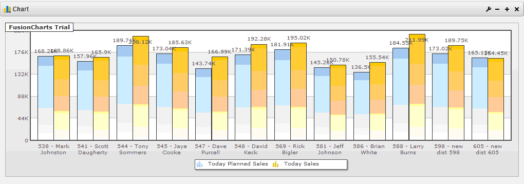
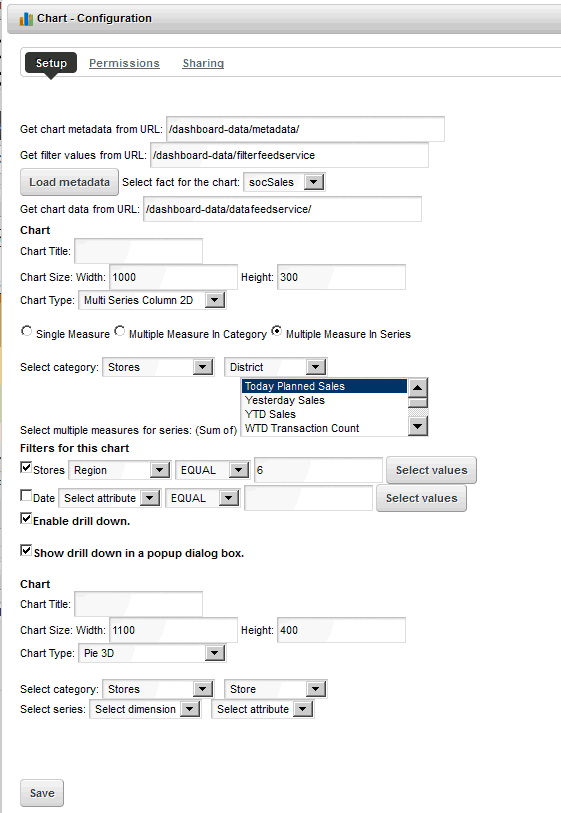
Sample chart 2 is “Today’s sales vs plan” chart. Let’s do the same way to enable the drill down charts for this chart. First let’s change the original chart’s settings, change the chart category from “store” to “district”, change the chart’s width to 1000 and then change the preset filter to “Region No. 6”, then save the settings. Now the original chart becomes:
Now open up the chart portlet configurations for this chart and check the checkbox in front of “Enable drill down” and also check the checkbox in front of “Show drill down in a popup dialog box”. In the drill down chart configuration section we set the chart width to 1100, the chart height to 400 and choose the chart type to “Pie 3D”, the chart category to “store”. Here’s the configuration screen:
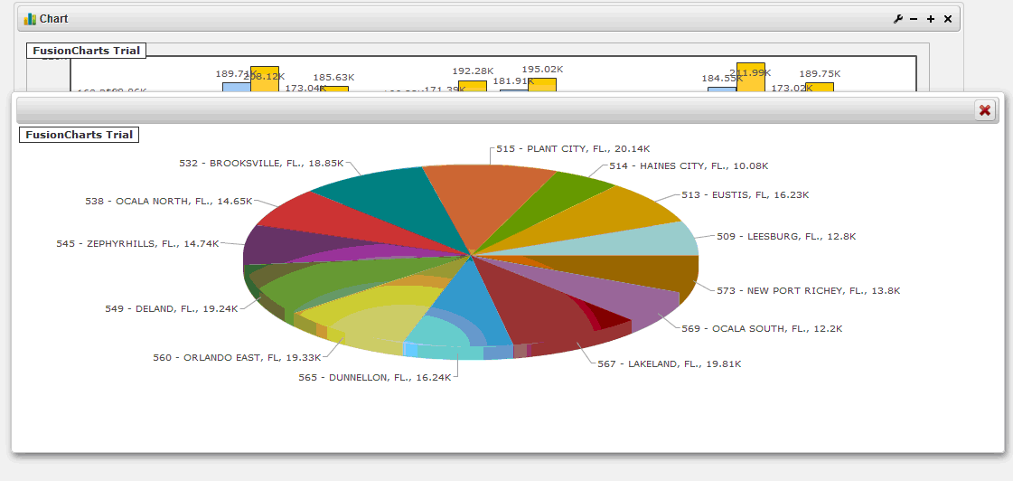
After the settings are saved, when the user clicks any columns in the original chart, a detailed pie chart will show in a pop up dialog box with the detailed data for all the stores within the district of the clicked column.
For more information about the dashboard framework for data warehouses in Liferay, please contact XTIVIA, Inc. at https://www.xtivia.com.