
Portlets are the basic building blocks of any site running Liferay. The default portlet styles are fine; but to really make your site sing, you can get a handle on them and dress them up to look as good as the rest of that theme you so lovingly handcrafted. Let’s start with the basics.
General Portlet Look and Feel
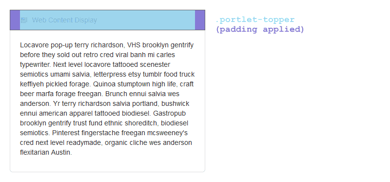
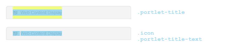
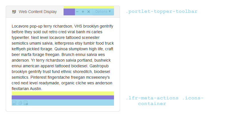
Here’s the basic HTML structure of a Liferay portlet. I’ve also included diagrams so you can get a feel of how all these pieces fit together.
<div id="[portlet UUID]" class="portlet-boundary">
    <div class="portlet-body">
        <section id="[portlet UUID]" class="portlet">
            <header class="portlet-topper">
                <h1 class="portlet-title">
                    <span>
                        <img class="icon">
                    </span>
                    <span class="portlet-title-text"> </span>
                </h1>
            </header>
            <div class="portlet-content">
                <div class="portlet-content-container">
                    <div class="portlet-body">
                    </div>
                </div>
            </div>
        </section>
    </div>
</div>
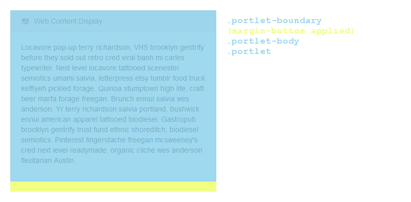

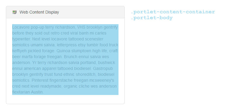
You may have noticed that .portlet-body is applied both to the content of the portlet and the entire body of the portlet. If you want to target it, be sure to qualify it as .portlet-boundary > .portlet-body or .portlet-content-container > .portlet-boundary. (From my experience, though, you’ll get the same results just as easily in the latter case by just targeting .portlet-content-container.)
Advanced Techniques
When ‘Edit Controls’ is checked, Liferay adds the class controls-visible to the body tag. (Ordinarily, the body gets the class controls-hidden.) Sometimes in the course of making your portlets more awesome, you can throw things off; especially when you start styling the portlet-topper. Here’s where to fix that:
Portlet Contents
There are common portlet content styles defined in JSR 286. In plain English, this means that these styles will work in any portlet anywhere, regardless of which flavor of portal you choose (Liferay, WebSphere, etc.) These styles are mainly for the benefit of the portal developers, but they can be handy hooks for front-end people as well.
Most of these are pretty much what they say on the tin, but I’ve made annotations where there may be some confusion.
Main Text
.portlet-font.portlet-font-dim
Messages
.portlet-msg-status
Status of the current operation.portlet-msg-info,.portlet-msg-info.pending
Help messages, general additional information, etc..portlet-msg-error
Error messages.portlet-msg-alert
Warning messages.portlet-msg-success
Success messages.portlet-msg-info-label,.portlet-msg-error-label,.portlet-msg-alert-label,.portlet-msg-success-label
Message labels
Tables and Sections
The official JSR 286 definitions I’ve included below provide separate classes for sections and tables (.portlet-section-header and .portlet-table-header, etc.) but the default Liferay portlet.css only includes section classes. This is probably because it’s default CSS carried over from earlier versions of Liferay which used the older JSR 168 standard. Make sure you talk to your portlet developers to make sure you’re on the same page!
.portlet-section-header,.portlet-section-subheader
Table or section header and subheader.portlet-section-body
Normal table cell text.portlet-section-alternate
Text in every other row in the table.portlet-section-body-hover,.portlet-section-alternate-hover
Hover styles — no CSS3 necessary!.portlet-section-selected
Text in a selected cell range.portlet-section-footer
Table or section footnote.portlet-section-text
Text otherwise associated with the table but doesn’t fall into one of the other categories, such as explanatory or help text
Forms
.portlet-form-label
Descriptive label of the whole form.portlet-form-field-label
Text that appears beside a user input text field (e.g. textarea).portlet-form-input-field
User input text field (e.g. textarea).portlet-form-field
Label for a non-text-input field, like checkboxes or radio buttons.portlet-form-button
Button text (e.g. ‘Submit’).portlet-icon-label
Text that appears beside a context-dependent action icon.portlet-dlg-icon-label
Text that appears beside a ‘standard’ icon (e.g. OK or Cancel)
Menus
.portlet-menu-caption
Caption describing the menu.portlet-menu
General menu settings such as background color, margins, etc..portlet-menu-item,.portlet-menu-item-hover
Normal, unselected menu item.portlet-menu-item-selected,.portlet-menu-item-hover-selected
Selected menu item.portlet-menu-cascade-item,.portlet-menu-cascade-item-selected
Sub-menu items.portlet-menu-description
Descriptive text for the menu (like an explanation below the menu)
This is not meant to be an exhaustive list…. a full list of default Liferay portlet styles can be found in /tomcat/webapps/ROOT/html/themes/_unstyled/css/portlet.css.
Complete Style Definitions
Fonts
The font style definitions affect the font attributes only (font face, size, color, style, etc).
| Style | Description | Example |
|---|---|---|
portlet-font |
Font attributes for the ‘normal’ fragment font. Used for the display of non-accentuated information. | Normal Text |
portlet-font-dim |
Font attributes are similar to the .portlet-font but the color is lighter. |
Dim Text |
Messages
Message style definitions affect the rendering of a paragraph (alignment, borders, background colour, etc.), as well as text attributes.
| Style | Description | Example |
|---|---|---|
portlet-msg-status |
Status of the current operation. | Progress: 80% |
portlet-msg-info |
Help messages, general additional information, etc. | Info about |
portlet-msg-error |
Error messages. | Portlet not available |
portlet-msg-alert |
Warning messages. | Timeout occurred, try again later |
portlet-msg-success |
Verification of the successful completion of a task. | Operation completed successfully |
Sections
Section style definitions affect the rendering of markup sections such as table, div, and span (alignment, borders, background colour, etc) as well as their text attributes.
| Style | Description |
|---|---|
portlet-section-header |
Table or section header |
portlet-section-body |
Normal text in a table cell |
portlet-section-alternate |
Text in every other row in the cell |
portlet-section-selected |
Text in a selected cell range |
portlet-section-subheader |
Text of a subheading |
portlet-section-footer |
Table or section footnote |
portlet-section-text |
Text that belongs to the table but does not fall in one of the other categories (e.g. explanatory or help text that is associated with the section). |
Tables
Table style definitions affect the rendering (i.e. alignment, borders, background color, etc.) and their text attributes.
| Style | Description |
|---|---|
portlet-table-header |
Table header |
portlet-table-body |
Normal text in a table cell |
portlet-table-alternate |
Text in every other row in the table |
portlet-table-selected |
Text in a selected cell range |
portlet-table-subheader |
Text of a subheading |
portlet-table-footer |
Table footer |
portlet-table-text |
Text that belongs to the table but does not fall in one of the other categories (e.g. explanatory or help text that is associated with the table). |
Forms
Form styles define the look and feel of the elements in an HTML form.
| Style | Description |
|---|---|
portlet-form-label |
Text used for the descriptive label of the whole form (not the labels for fields). |
portlet-form-input-field |
Text of the user input in an input field. |
portlet-form-button |
Text on a button. |
portlet-icon-label |
Text that appears beside a context-dependent action icon. |
portlet-dlg-icon-label |
Text that appears beside a ‘standard’ icon (e.g. OK or Cancel) |
portlet-form-field-label |
Text for a separator of fields (e.g. checkboxes, etc.) |
portlet-form-field |
Text for a field (not input field, e.g. checkboxes, etc) |
portlet-form-field-label |
Text that appears beside a form field (e.g. input fields, checkboxes, etc.) |
portlet-form-field |
Text for a field that is not an input field (e.g. checkboxes, etc.) |
Menus
Menu styles define the look and feel of the text and background of a menu structure. This structure may be embedded in the aggregated page or may appear as a context-sensitive popup menu.
| Style | Description |
|---|---|
portlet-menu |
General menu settings such as background color, margins, etc. |
portlet-menu-item |
Normal, unselected menu item. |
portlet-menu-item-selected |
Selected menu item. |
portlet-menu-item-hover |
Normal, unselected menu item when the mouse hovers over it. |
portlet-menu-item-hover-selected |
Selected menu item when the mouse hovers over it. |
portlet-menu-cascade-item |
Normal, unselected menu item that has submenus. |
portlet-menu-cascade-item-selected |
Selected sub-menu item that has sub-menus. |
portlet-menu-cascade |
General sub-menu settings such as background colour, margins, etc. |
portlet-menu-cascade-item |
A normal, unselected sub-menu item. |
portlet-menu-cascade-item-selected |
Selected sub-menu item. |
portlet-menu-cascade-item-hover |
Normal, unselected sub-menu item when the mouse hovers over it. |
portlet-menu-cascade-item-hover-selected |
Selected sub-menu item when the mouse hovers over it. |
portlet-menu-separator |
Separator between menu items. |
portlet-menu-cascade-separator |
Separator between sub-menu items. |
portlet-menu-content |
Content for a normal, unselected menu or sub-menu item. |
portlet-menu-content-selected |
Content for a selected menu or sub-menu item. |
portlet-menu-content-hover |
Content for an unselected menu or sub-menu item when the mouse hovers over it. |
portlet-menu-content-hover-selected |
Content for a selected menu or sub-menu item when the mouse hovers over it. |
portlet-menu-indicator |
Indicator that a menu item has an associated sub-menu. |
portlet-menu-indicator-selected |
Indicator when the associated menu item is selected. |
portlet-menu-indicator-hover |
Indicator when the associated menu item has the mouse hovering over it. |
portlet-menu-indicator-hover-selected |
Indicator when the associated menu item is selected and has the mouse hovering over it. |
portlet-menu-description |
Descriptive text for the menu (e.g. in a help context below the menu). |
portlet-menu-caption |
Menu caption. |
1 Java™ Portlet Specification, version 2.0 (2008-01-11), Appendix C. http://jcp.org/aboutJava/communityprocess/final/jsr286/index.html