
SUMMARY:
Developers can overcome the styling limitations of react-jsonschema-form by creating a custom theme that integrates Tailwind CSS and daisyUI to build visually flexible, modern, and schema-driven web forms.
- Extract the core templates and widgets from the RJSF source code to establish a foundational structure for your custom theme, rather than starting from scratch.
- Replace standard Bootstrap classes with daisyUI utility classes within the BaseInputTemplate and other widgets to achieve a polished design directly in the markup.
- Integrate third-party libraries such as React Select and React Datepicker by mapping their unique data objects and event handlers to the libraries’ internal schemas.
- Utilize the withTheme hook to assign the customized theme variable to the main Form component, ensuring consistent styling across all generated fields.
Adopting this modular customization approach allows development teams to maintain the rapid efficiency of schema-based forms while achieving a high-performance, branded user interface.
Table of contents
- SUMMARY:
- Using react-jsonschema-form With Tailwind CSS and daisyUI: Tools Used
- Using react-jsonschema-form With Tailwind CSS and daisyUI: Setting Up Our Foundation
- Using react-jsonschema-form With Tailwind CSS and daisyUI: Setting Up the RJSF Form
- Using react-jsonschema-form With Tailwind CSS and daisyUI: Integrating Tailwind and daisyUI
- Using react-jsonschema-form With Tailwind CSS and daisyUI: Final Product
We all know that react-jsonschema-forms and other schema based form engines save mountains of time and frustration when developing and maintaining a form-heavy app, but they can be inflexible and hard to customize.
React-jsonschema-form, also known as RJSF, uses themes to override its rendered html. They may seem daunting, but thankfully you can copy RJSF’s core theme from its source code and customize it pretty easily. In this example we’re going to create an RJSF theme that uses daisyUI, a tailwind library that sits right on top of plain html tags, the famous react-select, and react-datepicker. The last one is not strictly necessary since every modern browser has a native datepicker, but it’s good to have in our arsenal in case we need the customization.
Here’s what we’re going to set up:
See the finished product on GitHub.
Using react-jsonschema-form With Tailwind CSS and daisyUI: Tools Used
Next.js 12.2.x – The React Framework for Production – “Next.js gives you the best developer experience with all the features you need for production: hybrid static & server rendering”
Note: As long as you are running Tailwind CSS, daisyUI, and ReactJS, having your app run on Next.js is not required. However, I highly recommend Next.js for its sheer speed thanks to hybrid server side generation approach, image optimization API, and more.
Tailwind CSS 3.1.8 – “A utility-first CSS framework packed with classes like flex, pt-4, text-center and rotate-90 that can be composed to build any design, directly in your markup.”
daisyUI 2.24.0 – “The most popular, free and open-source Tailwind CSS component library.” Create fully styled cards, alerts, carousels, form fields, and more with vanilla html elements and a Tailwind class. I prefer it over Material UI because it simply applies css instead of manipulating the dom elements.
react-jsonschema-form 5.0.0beta2 – “A simple React component capable of using JSON Schema to declaratively build and customize web forms.”
React Select 5.4.0 – “A flexible and beautiful Select Input control for ReactJS with multiselect, autocomplete, async and creatable support.”
React Datepicker 4.8.0 – “A simple and reusable Datepicker component for React”
Now that we have our tools lined up, let’s get to work!
Using react-jsonschema-form With Tailwind CSS and daisyUI: Setting Up Our Foundation
Make sure you have next.js, react-jsonschema-form, Tailwind, daisyUI, react-select, and react-datepicker installed and configured. Below are all of the installation guides.
Install Tailwind CSS with Next.js
Install daisyUI as a Tailwind CSS plugin
Install React Jsonschema Form I’m using v5, which is in beta right now but is the npm default.
Using react-jsonschema-form With Tailwind CSS and daisyUI: Setting Up the RJSF Form
Form and ui schemas
I like to keep all my rjsf schemas and themes in a separate folder called forms. Let’s make our form schema and form UI schema.
├── forms
│ └── registration-form
│ ├── registrationFormSchema.ts
│ └── registrationFormUiSchema.ts
The schema is out of the box RJSF. If you’re not familiar with the library, the react-jsonschema-form playground has practically every use case you’ll ever need.
import { JSONSchema7 } from "json-schema";

export const registrationFormSchema:JSONSchema7 = {
   "title": "A registration form",
   "description": "A simple form example.",
   "type": "object",
   "required": [
     "firstName",
     "lastName"
   ],
   "properties": {
     "name": {
       "type": "string",
       "title": "Name",
       "default": "John Smith"
     },
     "gender": {
       "type": "string",
       "title": "Gender",
       "enum": ["Male", "Female", "Other"]
     },
     "hobbies": {
       "type": "array",
       "title": "Hobbies",
       "uniqueItems": true,
       "items": {
         "type": "string",
         "enum": ["Art", "Cooking", "Music", "Sports", "Movies"]
       }
     },
     "birthdate": {
       "title": "Birth Date",
       "type": "string",
       "format": "date"
     },
     "updated": {
       "type": "string",
       "title": "Would you like us to keep you updated?",
       "enum": ["Yes", "No"]
     },
     "waysToContact": {
       "type": "array",
       "title": "How do you want to receive updates?",
       "items": {
         "type": "string",
         "enum": [
           "email",
           "sms",
           "mail"
         ]
       },
       "uniqueItems": true
     },
   }
 };
forms/registration-form/registrationFormSchema.ts
Radio and checkbox groups share data types with select and multiselect respectively, so if we don’t want a select we have to specify in the ui schema.
export const registrationFormUiSchema = {
   "updated": {
     "ui:widget": "radio",
     "ui:options": {
       "inline": true
     }
   },
   "waysToContact": {
     "ui:widget": "checkboxes"
   },
 };
forms/registration-form/registrationFormUiSchema.ts
RJSF Theming
First let’s create an empty folder for our theme inside of /forms. I called mine rjsf-daisyui-theme.
├── forms
│ └── registration-form
│ ├── registrationFormSchema.ts
│ └── registrationFormUiSchema.ts
│ └── rjsf-daisyui-theme
Now in a different folder than our project folder, let’s checkout the rjsf source. Remember that we’re using 5.0.
$ git clone [email protected]:rjsf-team/react-jsonschema-form.git
$ git checkout tags/v5.0.0-beta.2
Once the proper tag is checked out, copy the fields, templates and widgets folders from /packages/core/src/components into the theme folder we just created. Your file structure should look like this:
├── forms
│ ├── rjsf-daisyui-theme
│ │ ├── fields
│ │ │ ├── ArrayField.tsx
│ │ │ ├── BooleanField.tsx
│ │ │ ├── MultiSchemaField.tsx
│ │ │ ├── NullField.tsx
│ │ │ ├── NumberField.tsx
│ │ │ ├── ObjectField.tsx
│ │ │ ├── SchemaField.tsx
│ │ │ ├── StringField.tsx
│ │ │ └── index.ts
│ │ ├── rjsfDaisyUiTheme.ts
│ │ ├── styles
│ │ │ └── select.styles.ts
│ │ ├── templates
│ │ │ ├── ArrayFieldDescriptionTemplate.tsx
│ │ │ ├── ArrayFieldItemTemplate.tsx
│ │ │ ├── ArrayFieldTemplate.tsx
│ │ │ ├── ArrayFieldTitleTemplate.tsx
│ │ │ ├── BaseInputTemplate.tsx
│ │ │ ├── ButtonTemplates
│ │ │ │ ├── AddButton.tsx
│ │ │ │ ├── IconButton.tsx
│ │ │ │ ├── SubmitButton.tsx
│ │ │ │ └── index.ts
│ │ │ ├── DescriptionField.tsx
│ │ │ ├── ErrorList.tsx
│ │ │ ├── FieldTemplate
│ │ │ │ ├── FieldTemplate.tsx
│ │ │ │ ├── Label.tsx
│ │ │ │ ├── WrapIfAdditional.tsx
│ │ │ │ └── index.ts
│ │ │ ├── ObjectFieldTemplate.tsx
│ │ │ ├── TitleField.tsx
│ │ │ ├── UnsupportedField.tsx
│ │ │ ├── array-field-template
│ │ │ └── index.ts
│ │ └── widgets
│ │ ├── AltDateTimeWidget.tsx
│ │ ├── AltDateWidget.tsx
│ │ ├── CheckboxWidget.tsx
│ │ ├── CheckboxesWidget.tsx
│ │ ├── ColorWidget.tsx
│ │ ├── DateTimeWidget.tsx
│ │ ├── DateWidget.tsx
│ │ ├── EmailWidget.tsx
│ │ ├── FileWidget.tsx
│ │ ├── HiddenWidget.tsx
│ │ ├── PasswordWidget.tsx
│ │ ├── RadioWidget.tsx
│ │ ├── RangeWidget.tsx
│ │ ├── SelectWidget.tsx
│ │ ├── TextWidget.tsx
│ │ ├── TextareaWidget.tsx
│ │ ├── URLWidget.tsx
│ │ ├── UpDownWidget.tsx
│ │ └── index.ts
│ └── sample-form
│ ├── sampleFormSchema.ts
│ └── sampleFormUiSchema.ts
Finally, we create a theme variable to pass in to our <Form> component.
import widgets from "./widgets"
import templates from "./templates";
import { WithThemeProps } from "@rjsf/core";
import fields from "./fields";

export const rjsfDaisyUiTheme: WithThemeProps = {
   fields,
   templates,
   widgets
};
forms/rjsf-daisyui-theme/rjsfDaisyUiTheme.ts
The form component
Now we are going to add a component to our components folder. We’re using the withTheme hook to assign our custom theme. Otherwise it’s a textbook RJSF implementation
import React from 'react';
import validator from "@rjsf/validator-ajv6";
import { withTheme } from '@rjsf/core';
import { registrationFormSchema } from '../forms/registration-form/registrationFormSchema';
import { rjsfDaisyUiTheme } from '../forms/rjsf-daisyui-theme/rjsfDaisyUiTheme';
import { registrationFormUiSchema } from '../forms/registration-form/registrationFormUiSchema';

const ThemedForm = withTheme(rjsfDaisyUiTheme);
const RegistrationForm = () => {
   return (
   <div className='max-w-2xl mx-auto card'>
       <div className='card-body'>
           <ThemedForm schema={registrationFormSchema} uiSchema={registrationFormUiSchema} validator={validator} />
       </div>
   </div>
   )
}
export default RegistrationForm;
Using react-jsonschema-form With Tailwind CSS and daisyUI: Integrating Tailwind and daisyUI
Here are the components we’re going to be using Tailwind CSS Components
Inputs
Text Input — Tailwind CSS Components
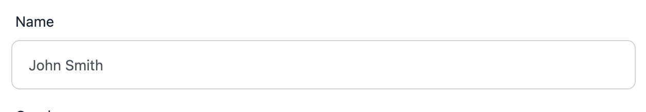
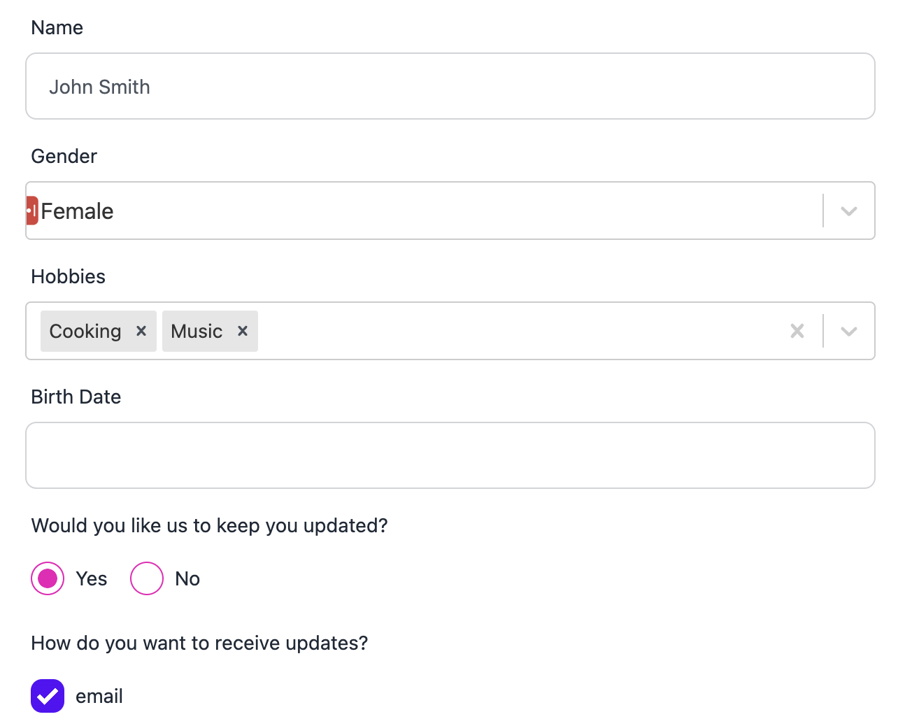
If you do a code search for BaseInputTemplate in your IDE, you’ll see that quite a few components use it. And since Bootstrap (which the base theme is styled with) and daisyUI both use a vanilla html input component, this change is super easy.
All we’re doing is changing bootstrap’s “form-control” class to daisyUI’s “input input-bordered”, and then we’re done!
     <input
       key={id}
       id={id}
       className="input input-bordered"
       readOnly={readonly}
       disabled={disabled}
       autoFocus={autofocus}
       value={inputValue}
       {...inputProps}
       list={schema.examples ? `examples_${id}` : undefined}
       onChange={_onChange}
       onBlur={_onBlur}
       onFocus={_onFocus}
     />
forms/rjsf-daisyui-theme/templates/BaseInputTemplate.tsx:65-78
Checkbox Group
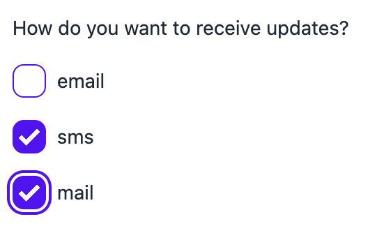
Checkbox — Tailwind CSS Components
Checkboxes on daisyUI and Bootstrap are both vanilla <input type=”checkbox”> elements with some classes sprinkled on top, so it’s almost as easy. The only difference is that RJSF has a bit of a convoluted way of doing inline checkboxes. We’re going to replace it with a simpler tailwind solution.
First off, we’re going to change classes on the parent checkbox container.
<div className="checkboxes" id={id}>forms/rjsf-daisyui-theme/widgets/CheckboxesWidget.tsx:31 (old)
<div className={`flex checkboxes ${inline ? 'flex-row gap-2' : 'flex-col'}`} id={id}>forms/rjsf-daisyui-theme/widgets/CheckboxesWidget.tsx:31 (new)
Both libraries use the “checkboxes” class so we can keep that as is, but the RJSF “inline” prop will decide whether the flex direction is “row” or “column”. We also add a 0.5rem gap to inline checkboxes.
Here’s RJSF’s default implementation, which uses a completely different structure based on whether inline is set or not.
         const checkbox = (
           <span>
             <input
               type="checkbox"
               id={`${id}_${index}`}
               checked={checked}
               disabled={disabled || itemDisabled || readonly}
               autoFocus={autofocus && index === 0}
               onChange={handleChange}
             />
             <span>{option.label}</span>
           </span>
         );
         return inline ? (
           <label key={index} className={`checkbox-inline ${disabledCls}`}>
             {checkbox}
           </label>
         ) : (
           <div key={index} className={`checkbox ${disabledCls}`}>
             <label>{checkbox}</label>
           </div>
         );
       })}
forms/rjsf-daisyui-theme/widgets/CheckboxesWidget.tsx:49-71 (old)
Since we already handled inline css, we don’t need to worry about any of that. We can remove the display logic and use the documentation to change the html structure. Notice that the div has a key prop.
         return (
           <div key={`${id}_${index}_container`} className="form-control">
             <label className="justify-start gap-2 cursor-pointer label">
               <input
                 key={`${id}_${index}`}
                 className="checkbox checkbox-primary"
                 type="checkbox"
                 id={`${id}_${index}`}
                 checked={checked}
                 disabled={disabled || itemDisabled || readonly}
                 autoFocus={autofocus && index === 0}
                 onChange={handleChange}
               />
               <span className="label-text">{option.label}</span>
             </label>
           </div>
         );
       })}
forms/rjsf-daisyui-theme/widgets/CheckboxesWidget.tsx:49-66 (new)
There’s one difference from the daisyUI documentation. If you look at daisyUI’s example checkboxes, the label, which acts as a container for the radio, is justified space-between by default. We changed it to justify-start and added a little gap so they’re not right against each other.
We have it set to checkbox-primary for this example. If you wanted to, you could make primary/secondary a UI option.
Radio Group

Radio — Tailwind CSS Components
Radio groups are not very different from Checkbox Groups. First, we have our ternary that evaluates the inline option.
<div className="field-radio-group" id={id}>forms/rjsf-daisyui-theme/widgets/RadioWidget.tsx:38 (old)
<div className={`flex field-radio-group ${inline ? 'flex-row gap-2' : 'flex-col'}`} id={id}>forms/rjsf-daisyui-theme/widgets/RadioWidget.tsx:38 (new)
And the input/container.
        const radio = (
           <span>
             <input
               type="radio"
               id={`${id}_${i}`}
               checked={checked}
               name={name}
               required={required}
               value={option.value}
               disabled={disabled || itemDisabled || readonly}
               autoFocus={autofocus && i === 0}
               onChange={handleChange}
               onBlur={handleBlur}
               onFocus={handleFocus}
             />
             <span>{option.label}</span>
           </span>
         );

         return inline ? (
           <label key={i} className={`radio-inline ${disabledCls}`}>
             {radio}
           </label>
         ) : (
           <div key={i} className={`radio ${disabledCls}`}>
             <label>{radio}</label>
           </div>
         );
       })}
forms/rjsf-daisyui-theme/widgets/RadioWidget.tsx:49-77 (old)
        const radio = (
           <>
             <input
               type="radio"
               className="radio radio-secondary"
               id={`${id}_${i}`}
               checked={checked}
               name={id}
               required={required}
               value={option.value}
               disabled={disabled || itemDisabled || readonly}
               autoFocus={autofocus && i === 0}
               onChange={handleChange}
               onBlur={handleBlur}
               onFocus={handleFocus}
             />
             <span className="label-text">{option.label}</span>
           </>
         );

         return (
           <label key={i} className={`label justify-start gap-2 ${disabledCls}`}>
             {radio}
           </label>
         )
       })}
forms/rjsf-daisyui-theme/widgets/RadioWidget.tsx:49-74 (new)
Select
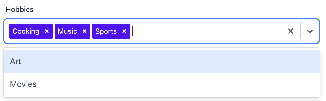
Select — Tailwind CSS Components
For the last three fields we’ve used html inputs with a few daisyUI classes tacked on, but since there is no native HTML multiselect/filter implementation, we’re going to use the react-select library.
First we import the library. MultiValue and SingleValue are types.
import Select, { MultiValue, SingleValue } from 'react-select';Now we replace the returned JSX element with React-Select. The options are passed to React-Select as a {label,value} object, so we don’t need to create <option> tags.
As a bonus, fortunately RJSF passes {label, value} objects for its enum by default, so we can pass the enumOptions prop as is.
return (
   <Select
     id={id}
     instanceId={id}
     isMulti={multiple}
     value={getSelectValue()}
     isDisabled={disabled || readonly}
     autoFocus={autofocus}
     options={enumOptions}
     onChange={handleChange}
     onBlur={handleBlur}
     onFocus={handleFocus}
     styles={selectStyles}
   />
 );
}
Now it’s time to change the getValue, onChange, onBlur, and onFocus to accommodate React-Select.
Getting the React-Select Value
React-Select passes the entire enum object around, whereas RJSF passes the object’s value, so there’s a bit of a miscommunication between the two.
So let’s create a getter function that will use RJSF’s value to find the enum string that React-Select is looking for.
 const getEnumObjectFromVal = (val:string) => {
   return enumOptions?.find((option:Option) => option.value === val) || {label:"", value:""}

 }
 const getSelectValue = () => {
   let selectValue: Option | Option [] | undefined = undefined;
   if (multiple && Array.isArray(value)) {
     selectValue = value.map(val => getEnumObjectFromVal(val.toString()));
   } else if (value) {
     selectValue = getEnumObjectFromVal(value.toString());
   }
   return selectValue;
 }
forms/rjsf-daisyui-theme/widgets/SelectWidget.tsx:61-69
We have 2 separate cases: single values and multiple values. A default (single) select expects a {label, value} object, while a multiselect expects an array of {label, value} objects.
For both types we’re running our string values into the getEnumObjectFromVal function. If the enum from our schema doesn’t include the current value, the select box gets blanked out. We don’t expect that to happen but we need to account for the edge case.
Change events
 const handleChange = useCallback(
   (event: ChangeEvent<HTMLSelectElement>) => {
     const newValue = getValue(event, multiple);
     return onChange(processSelectValue(schema, newValue, options));
   },
   [onChange, schema, multiple, options]
 );
forms/rjsf-daisyui-theme/widgets/SelectWidget.tsx (old)
 const handleChange = useCallback(
   (event: MultiValue<EnumOptionsType> | SingleValue<EnumOptionsType>) => {
     let newValue: string | string[] | undefined;
     if (multiple && Array.isArray(event)) {
       newValue = event.map((option) => option.value);
     } else {
       const singleEvent = event as SingleValue<EnumOptionsType>
       newValue = singleEvent?.value;
     }
     return onChange(processSelectValue(schema, newValue, options));
   },
   [onChange, schema, multiple, options]
We apply the opposite logic for change events. React-Select gives us a {label, value} object, and we have to pass a string as the newValue param to RJSF’s procesSelect method.
We also need to change type signatures to match react-select.
Focus and Blur
Finally, we need to trigger any possible focus and blur callbacks when react-select focus and blur events are fired. Focus and Blur in react-select pass the htmlInput event handler which doesn’t have values and focus/blur events don’t change the value anyways, so we’re going to use the RJSF value as the single source of truth and ignore the event that gets passed.
Here’s the old one, which uses the event.
 const handleFocus = useCallback(
   (event: FocusEvent<HTMLSelectElement>) => {
     const newValue = getValue(event, multiple);
     return onFocus(id, processSelectValue(schema, newValue, options));
   },
   [onFocus, id, schema, multiple, options]
 );

 const handleBlur = useCallback(
   (event: FocusEvent<HTMLSelectElement>) => {
     const newValue = getValue(event, multiple);
     return onBlur(id, processSelectValue(schema, newValue, options));
   },
   [onBlur, id, schema, multiple, options]
 );
forms/rjsf-daisyui-theme/widgets/SelectWidget.tsx (old)
And here’s our simpler implementation.
 const handleFocus:FocusEventHandler<HTMLInputElement> = useCallback(
   () => onFocus(id, processSelectValue(schema, value, options)),
   [onFocus, id, schema, multiple, options]
 );

 const handleBlur:FocusEventHandler<HTMLInputElement> = useCallback(
   () =>  onBlur(id, processSelectValue(schema, value, options)),
   [onBlur, id, schema, multiple, options]
 );
forms/rjsf-daisyui-theme/widgets/SelectWidget.tsx (new)
Finally, our React-select implementation doesn’t quite match the look of Daisy’s inputs.
import { GroupBase, StylesConfig } from "react-select";
import { Option } from "../../../interfaces/Option.interface";

export const selectStyles:StylesConfig<Option, boolean, GroupBase<Option>> = {
   option: (provided, state) => ({
     ...provided
   }),
   control: (provided) => ({
       ...provided,
       borderRadius: '0.5rem',
       height: '3rem',
   }),
   singleValue: (provided, state) => {
     const opacity = state.isDisabled ? 0.5 : 1;
     const transition = 'opacity 300ms';
      return { ...provided, opacity, transition };
   },
   multiValue: (styles, { data }) => ({
       ...styles,
       backgroundColor: "#560DF8",
       color: "white",
   }),
   multiValueLabel: (styles, { data }) => ({
       ...styles,
       color: "white",
     }),
 }
I advise populating your background color with the same source of truth that’s setting your DaisyUI theme. I highly recommend using Design Tokens to inform your color and typography. In fact, I recently wrote a blog post about it!
Now our look and feel matches the other elements in our form.
Datepicker (optional)
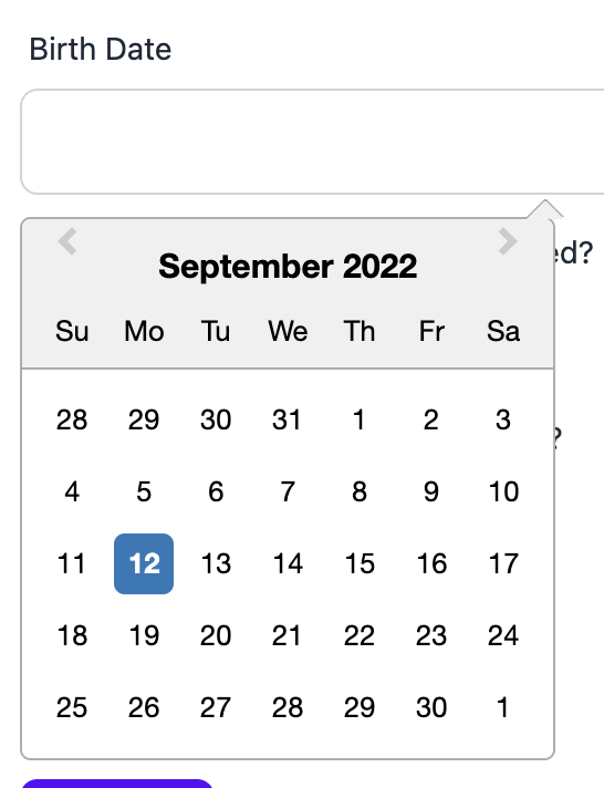
For this example I’m going to show a very basic instance of react-datepicker. Like I stated earlier, all modern browsers have native functionality so only use this if you need more than the native date fields offer.
import React, { useCallback, useEffect } from "react";
import { getTemplate, WidgetProps } from "@rjsf/utils";
import DatePicker from "react-datepicker";
import "react-datepicker/dist/react-datepicker.css";

/** The `DateWidget` component uses the `BaseInputTemplate` changing the type to `date` and transforms
* the value to undefined when it is falsy during the `onChange` handling.
*
* @param props - The `WidgetProps` for this component
*/
export default function DateWidget<T = any, F = any>(props: WidgetProps<T, F>) {
 const { onChange } = props;

 const handleChange = useCallback(
   (selectedDate: Date) => {
     onChange(selectedDate?.toISOString().split('T')[0] || undefined);
   },
   [onChange]
 );

 const getValue = () => {
   const offset = new Date().getTimezoneOffset();
   return props.value ? new Date(`${props.value}T19:00:00.${offset}Z`) : null;
 };

 return <DatePicker selected={getValue()} className="w-full input input-bordered" onChange={handleChange} />;
}
forms/rjsf-daisyui-theme/widgets/DateWidget.tsx
Before we do anything, let’s import the DatePicker component.
import DatePicker from "react-datepicker";Remove BaseInput
First off, we’re not using BaseInputTemplate, so we can remove this instantiation. We don’t need to replace it with anything.
 const BaseInputTemplate = getTemplate<"BaseInputTemplate", T, F>(
   "BaseInputTemplate",
   registry,
   options
 );
packages/core/src/components/widgets/DateWidget.tsx:11-15 (old)
OnChange
The default “date” input type uses an ISO formatted YYYY-MM-DD string, whereas react-datepicker uses a JS Date instance. So our onChange is going to have to convert to ISO to match react-jsonschema-form’s expectations.
 const handleChange = useCallback(
   (value: React.ChangeEvent) => onChange(value || undefined),
   [onChange]
 );
packages/core/src/components/widgets/DateWidget.tsx:16-19 (old)
 const handleChange = useCallback(
   (selectedDate: Date) => {
     onChange(selectedDate?.toISOString().split('T')[0] || undefined);
   },
   [onChange]
 );
packages/core/src/components/widgets/DateWidget.tsx:14-19 (new)
getValue
Now we need to create a valueGetter that converts react-jsonschema-form’s string into Date. Remember that react-jsonschema-form is our source of truth. The out of box implementation does not have a value getter, so we are simply adding this.
 const getValue = () => {
   const offset = new Date().getTimezoneOffset();
   return props.value ? new Date(`${props.value}T19:00:00.${offset}Z`) : null;
 };
packages/core/src/components/widgets/DateWidget.tsx:21-24 (new)
The DOM element
Finally, let’s render the DOM element.
return <DatePicker selected={getValue()} className="w-full input input-bordered" onChange={handleChange} />;Again, the native browser datepicker should suffice, but if you want more customization or even just look+feel consistency across browsers, you have the option.
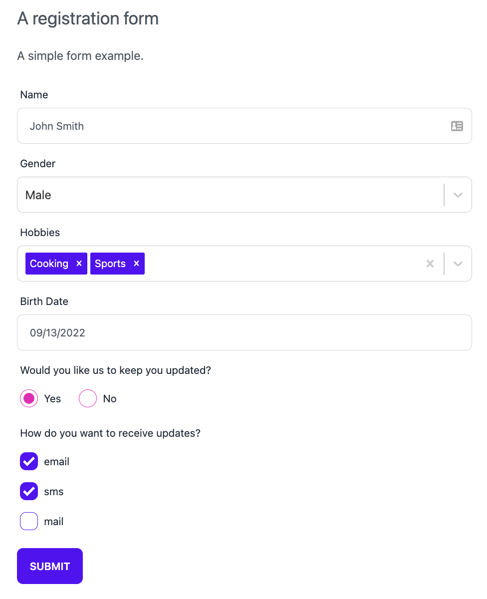
Using react-jsonschema-form With Tailwind CSS and daisyUI: Final Product
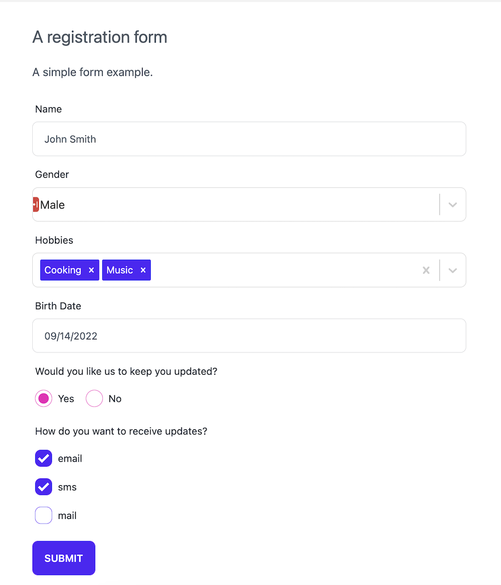
Now we have a react-jsonschema-form instance that not only uses daisyUI and Tailwind, React Select, and React Datepicker, but can be easily extended with any other library that serves your purposes.
Please reach out with any questions you may have!