Data is everywhere, and there is an increasing need to consume data in many different ways. Unstructured data or data without meaning doesn’t help the organizations or consumers very much; it should be transformed into actionable insights. One can consume data in multiple ways, but the best way is through data stories and visualizations that help the audience make informed decisions.
Data visualization is a great way to present the data in a meaningful, interactive way and provide an immersive experience to the users. Sometimes, a single data viz (aka, data visualization) might not convey the whole narrative to the users. This is where “Data people” turn into storytellers. To create effective data stories, one must understand the data, its context, and the findings in order to deduce meaning for an audience that doesn’t. Data visualization and storytelling are not the same; they are mutually exclusive.
“There’s nothing in the world more powerful than a good story.”
Tyrion Lannister (Game of Thrones)
With the availability of many tools and applications in the market, anyone can create a data visualization quickly, but there lies the issue of misrepresentation and misinformation. This blog outlines the effective ways to create data visualizations and data stories and also common pitfalls to avoid when creating visualizations and dashboards. This is useful for business analysts, data analysts, managers, and anyone who wants to create or consume data visually.
Before diving into the methods of creating and using visualizations, we need to understand the types of analysis, i.e., Exploratory vs. Explanatory analysis. Exploratory analysis is what we do on the data to understand and figure out what might be important or useful to the question that we are trying to answer. All of these analyses might not yield useful results that can be relayed to the end audience. We really want to showcase the end findings, which is the explanatory analysis.
When it comes to explanatory analysis, we must ask three important questions to understand the context of data visualization. This can be known by asking ourselves three questions. Firstly, who is the target audience? The data literacy of our audience will heavily influence the kind of data visualization we need to build. Secondly, what do we want your audience to know or do? This is the point where we think about the actions that the audience needs to take based on the content we create. Finally, how can we use data to help make our point? Data becomes the supporting evidence for the story we will create and tell.
Choosing Correct Data Visualizations
“Form follows function.”
Louis Sullivan
Choosing the right visualization among many options can be challenging. Visualization type should be picked based on the purpose that it serves but not on the visual aesthetics. Once we identify the right type, we can decide which specific chart best communicates our insight. Following are the common categories that we come across frequently.
1. Simple Text: When we have to show one or two values, simple text is a great visual to use in a story. It can also be used to display key performance indicators (KPIs) in an executive dashboard. The use of simple text can be elevated by adding a few supporting words, and this makes a world of difference to end users by providing clarity and context. For example, Uzbekistan had the highest literacy rate in the world in 2018. To show this in a report, you can use simple text to highlight the metric as below.

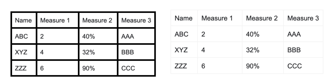
2. Tables: Tables are great for explanatory analysis as they can communicate multiple measures at the same time. They are easy to read and understand when there are limited rows and columns. One great way to create a table is to use light borders or white spaces rather than thick and heavy borders. This makes the data stand out, not the borders.
In the below example, tables with thick borders feel bulky whereas thin borders feel light and the data stands out immediately.
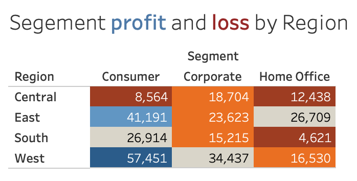
3. Heatmap: This chart is another version of a table where we add a layer of detail by using gradient-colored cells that convey the relative magnitude of the numbers. This reduces mental processing, and the eye automatically goes to the potential points of interest. One important thing to remember is to include a legend indicating the color used in the heatmap.
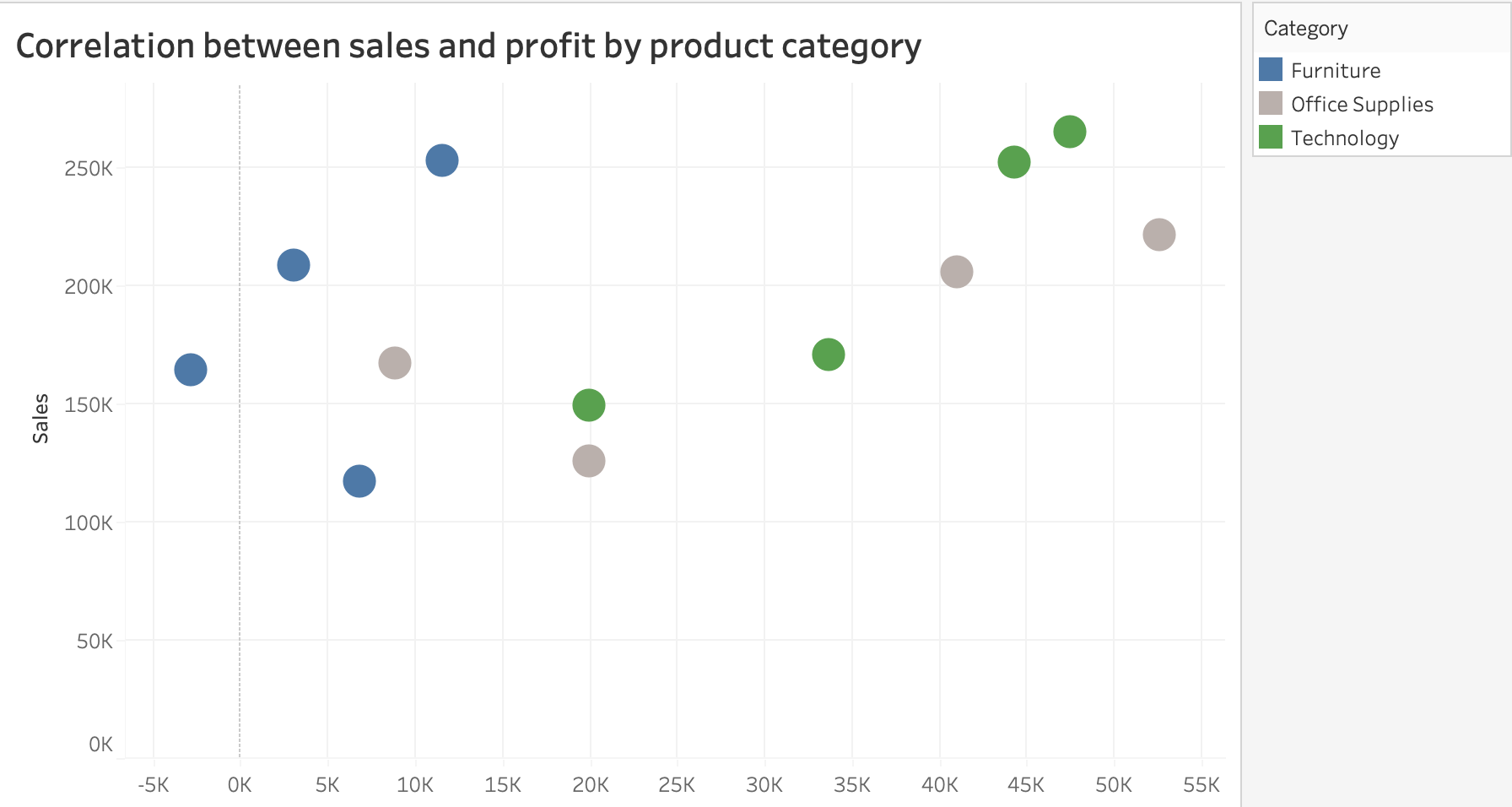
4. Scatter Plot: Scatterplot is used to show the relationship between two numeric variables. This helps the user understand the variables’ correlation where each dot represents values in a given space.
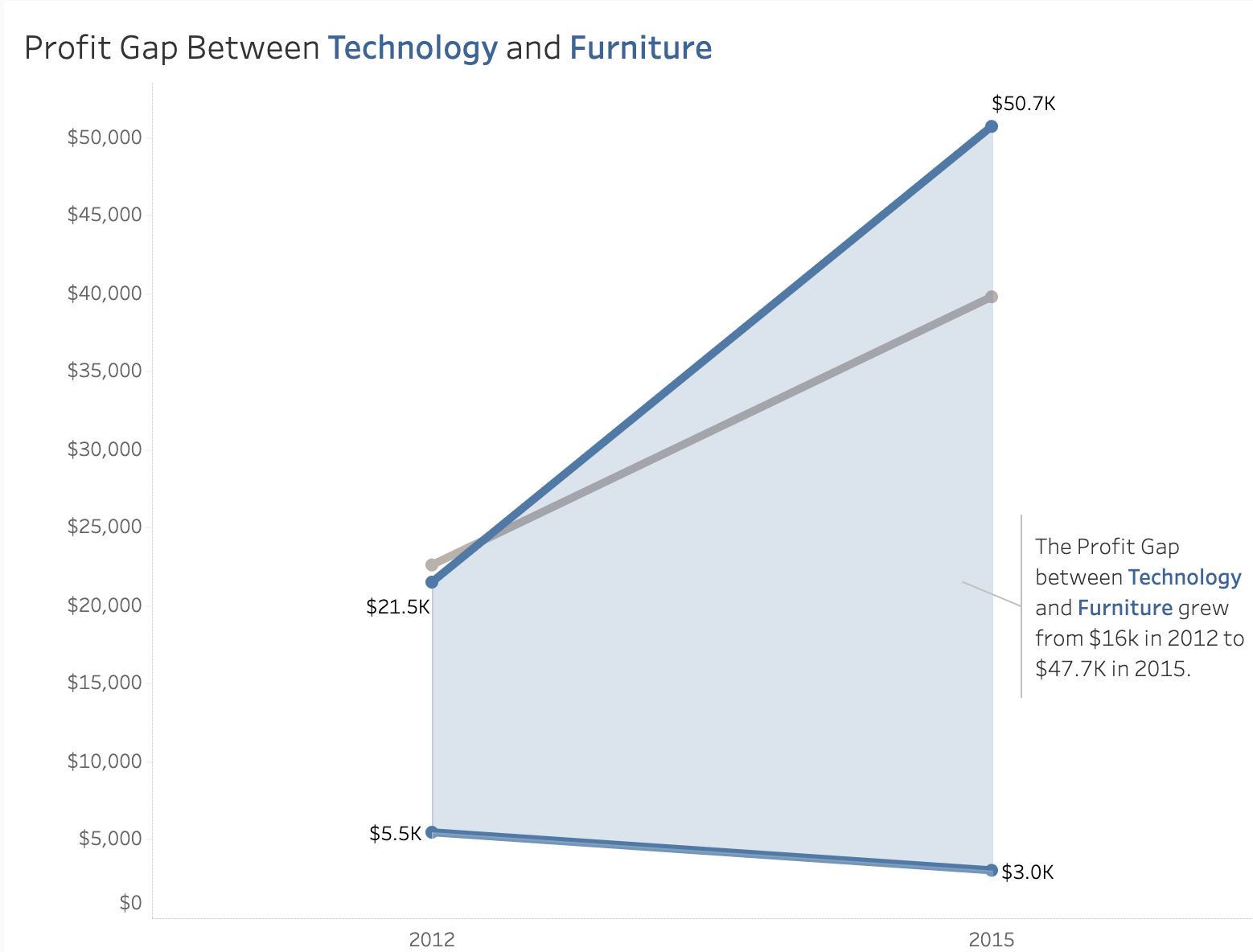
5. Line Graph: Line graphs are commonly used for continuous data. Time series analysis is an excellent example of a line graph with time on the X-axis and a measure on the Y-axis. Sometimes, line and bar graphs can be combined where the bars represent the measure, and the lines represent the statistics of the measure.
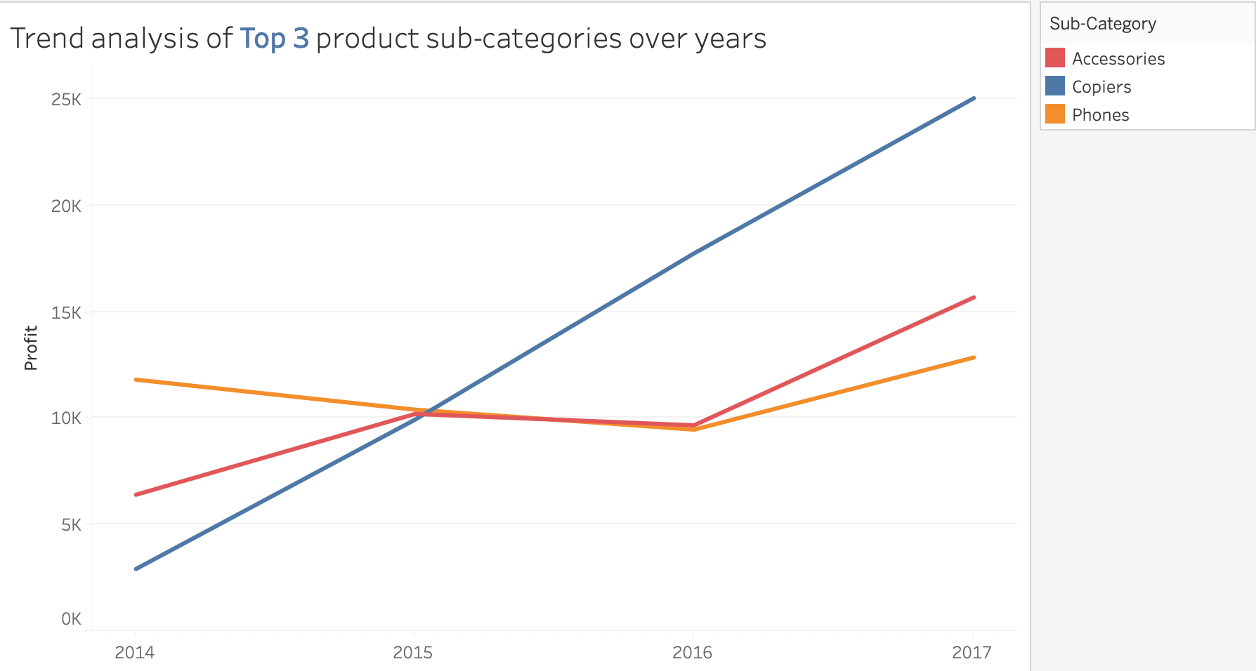
6. Slope Graph: This is another line graph variation primarily used to show relative increases and decreases across various categories between the two data points. Examples include visualization of yearly rankings, rate of changes between years, etc. Again, the use of colors helps the users to pinpoint an increase or decrease in that category.
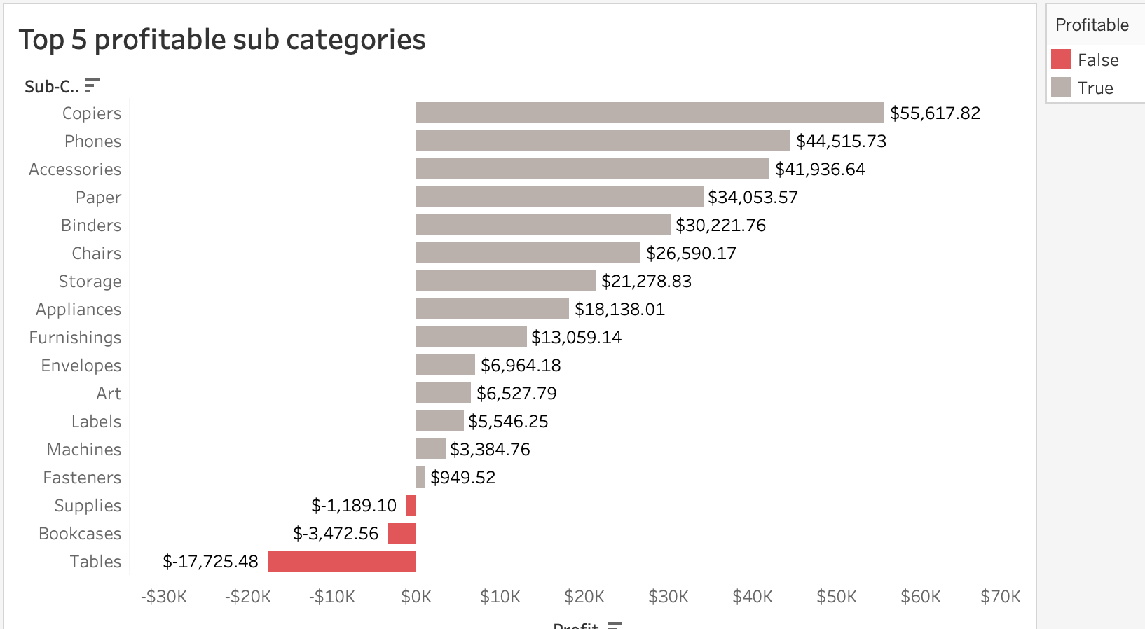
7. Bar Chart: Bar charts are very common and widely used. This also makes bar charts versatile and easy to understand. Our eyes compare the endpoints of the bars to determine which category is the biggest or smallest. We must be careful of the baseline, which generally starts from 0. Only when we provide context to the elevated baseline its use is justifiable. Also, place the y-axis labels on the left side rather than the right side as the user tends to start interpreting the graph from left to right, and immediately, they can see the baseline starting value. The width of the bars should be more than the white space between the bars.
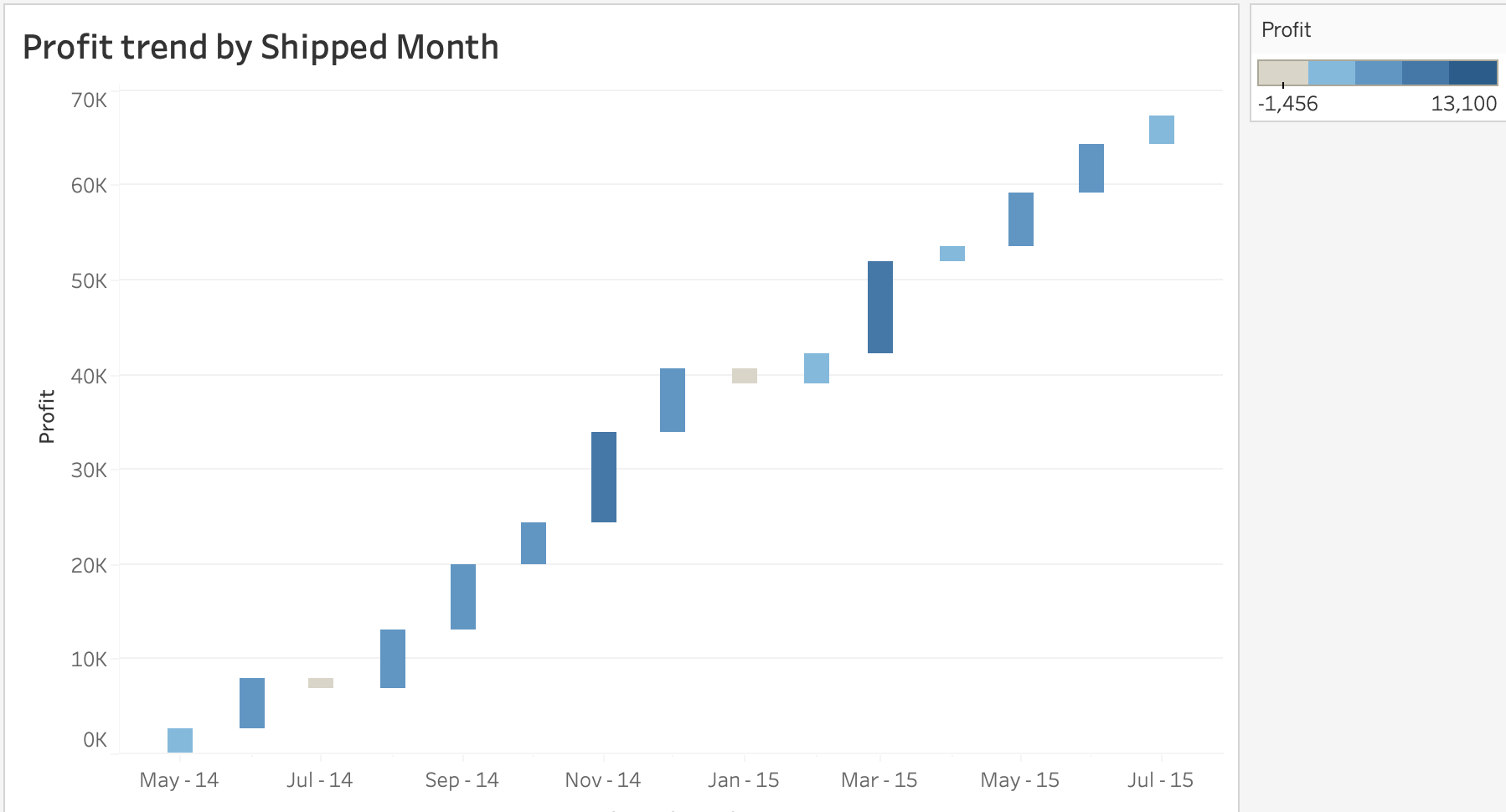
8. Waterfall Chart: A waterfall chart is a bar chart where only starting points, increases and decreases, and resulting ending points are shown as opposed to a full stacked graph. This is useful to show how an initial value is affected by a series of positive and negative values. The columns are color-coded so we can quickly identify positive and negative values.
Graphs To Be Avoided
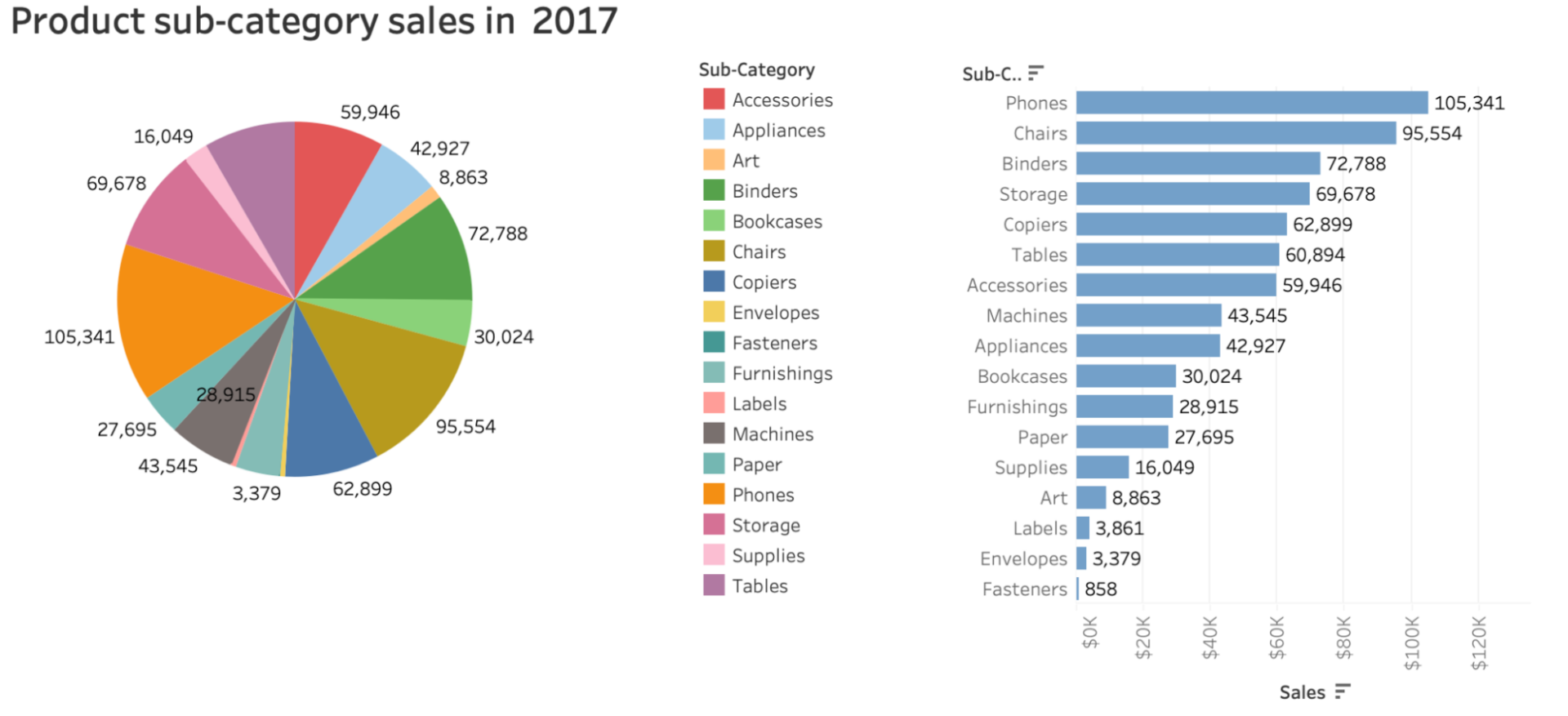
Pie and donut charts: Pie and donut charts look easy on the eyes but are very hard to interpret, mainly when the values are close, or the pie sizes are relatively equal. The best any user can discern is which piece is larger, but they cannot determine how much. To get over this, we can add data labels on the pieces, but still, there is a chance of data misrepresentation. This problem is elevated by using 3D charts where the pie is shown as tilted and the pieces at the top appear away, making them seen as smaller than they actually are. Alternatively, use a horizontal bar chart because they are organized at a common baseline, and they are easy to assess relative sizes, as shown in the below example.
Declutter the Visualization
“A wealth of information creates a poverty of attention.”
Herbert A. Simon, economist and political scientist
Humans have a limited amount of processing power which means we make a mental effort to process new information. When we create a data story or dashboard, we leverage the audience’s mental processing power to understand the content. As data storytellers, we need to be smart to use the audience’s brain power on the things that are insightful and avoid clutter. To determine what clutter is, we can follow the principles of visual perception. This means how we see order in the natural world. Some of the principles are discussed below.
- Similarity: Humans perceive objects which are the same color, size, or shape to a group. We can leverage this technique in a table or heatmap to highlight groups of values with the same color. This eliminates the need for additional elements, such as borders to help direct our attention.
- Enclosure: We think the enclosed objects belong to the same group. To leverage this principle is to design a distinction within the data visualization. This can be done by changing the background color. Instantly, the audience will pay attention to the enclosed section.
- Connection: Any connection between the data points would be the strongest perception of belonging to the same group. This principle is most evident in line graphs.
Once we identify what we are communicating, we can reduce clutter by following some guidelines as mentioned below.
- Align the text content to either the left or right-hand side of the visual, this creates a clean line and the overall layout appears well organized.
- Use white space strategically to pause the information flow and allow users to process the insights. If needed, allot an entire page for a single visualization to make it important.
- Remove chart borders as they don’t add any value but increase visual clutter. Instead, use whitespace to distinguish the visual from other elements on the page as needed.
- Remove gridlines or use thin and light colors like gray.
- Remove the data markers if the data can be easily understood. Use them only if they serve a purpose, don’t make them default.
- Clean up the axis labels like using ‘M’ for millions or short month and day names etc. Keep the labels as minimal as possible.
- Place the legend right next to the visualization instead at the bottom or top. Sometimes, label the data directly in the visualization itself to make it easier for the audience to understand.
- Use consistent color throughout the data story. This includes data labels in the legend as well. This is another visual cue to the audience indicating they are related information.
Grab the Audience’s Attention
Eliminating clutter is one side of effective data visualization. Another side of effective storytelling is shifting the audience’s attention to the actual insights by using visual attributes like color, size, and position on the page. There shouldn’t be any scope for misunderstanding and confusion regarding the analysis we are trying to deliver. To achieve this, first, we need to get the audience’s attention and then create a visual hierarchy to lead the audience through the information we want to communicate in the way we want them to process it. Below are the ways to leverage visual attributes like color, size, and position in the data visualizations.
- To grab the attention in a graph or simple text, use bold colors against muted colors like gray. Also, use colors sparingly and consistently to avoid confusion. Choose color tones according to the requirement, not based on our liking. Sometimes, using standard colors that an organization prefers is a safe way to avoid any issues.
- Size matters. When we are creating charts of equal importance, size them equally. If there is one significant insight that you want to highlight, make it big.
- Most humans start at the top left corner of the page and scan through the page in a ‘Z’ shape. So, having the page title and important information on the top left is really important. In data visualization, think about which data you want to show the audience first. For example, if you want to show the top 10 most populous countries in the world in 2022, create a bar chart with populations in ascending order. This will ensure the audience sees the top country first. The position of each data visualization should be natural and easy to understand.
- Create intuitive and interactive graphs which are easy to use. Make all the interactions, like filters, apply/reset buttons, etc., accessible. Sometimes, add a ‘Help’ hyperlink with the intended business use of the reports or dashboard.
- When using simple text along with charts, use simple language and spell out acronyms for at least some of the charts so that users can easily understand.
- Aesthetics are very important when it comes to data storytelling. Aesthetically pleasing visualization is perceived as easier to use and widely accepted. Spend time on overall design consistency.
Finally, the most important thing for any data visualization or story to be effective is acceptance by the targeted audience. Like any good story, the start should set the context. The middle should delve into details of the problem statement and the end should provide a clear actionable insight. Creating effective data visualizations takes practice and by following the outlined design principles, one can easily communicate insights to all levels of business management.
If you have any questions about this blog or need help with creating effective BI reports and dashboards, please contact us.