
It’s not easy or obvious how to build a custom Material UI select component and make it work with React Hook Form (RHF). It’s a shame, because RHF is a small dependency, with a modern React hook-centric API, that brings to the table better form performance as compared with its more well-known alternative, Formik.
In the past few years since I’ve been following the project, RHF (now version 7) has evolved immensely. Unfortunately, major releases have been breaking changes, and documentation and examples that work with version 7 are harder to find at the time of this writing.
Specifically, what I’m about to show you has changed completely since RHF versions 5 and 6. Good news: the changes have been for the better. Bad news: it can be hard to find examples and sample code that work with RHF version 7. So here goes my attempt to help.
Full code can be found at https://github.com/bkinsey808/nx-graphql-fullstack and I hope to continue with a series of blog posts explaining some of the interesting technologies used in this repo.
Why I like RHF over Formik
In spite of its rapid changes, I prefer RHF over Formik. RHF has:
(1) a modern, hook-centric API,
(2) a smaller bundle size,
(3) better performance.
For a more thorough comparison, check out https://blog.logrocket.com/react-hook-form-vs-formik-comparison/
The Challenge
In the past, one of the big challenges of RHF was getting it to work with Material UI components. In the dark days of yore, since Material UI components did not expose the direct HTML input elements, you had to access ref references and register them. The syntax was challenging and there was a significant learning curve. The solution I present here does not use any refs.
I chose to demo Material UI Select specifically because it seems to be one the hardest of the most common elements, not just to integrate with RHF, but for testing as well, which we will see in a future blog post perhaps.
The requirements for my custom select component are:
- Must integrate well with RHF
- Must customize the Material UI component, e.g. pulldown appears under not on top of the always visible label and value of the field, more like a standard HTML select.
- Memoized to prevent unnecessary rerenders. See https://dmitripavlutin.com/use-react-memo-wisely/
- Must be testable
How to use AppSelect
The AppSelect component in this case is used to build a theme switcher pull down. This pull down responds immediately on change and switches the theme. Therefore, we use RHF watch instead of handleSubmit.
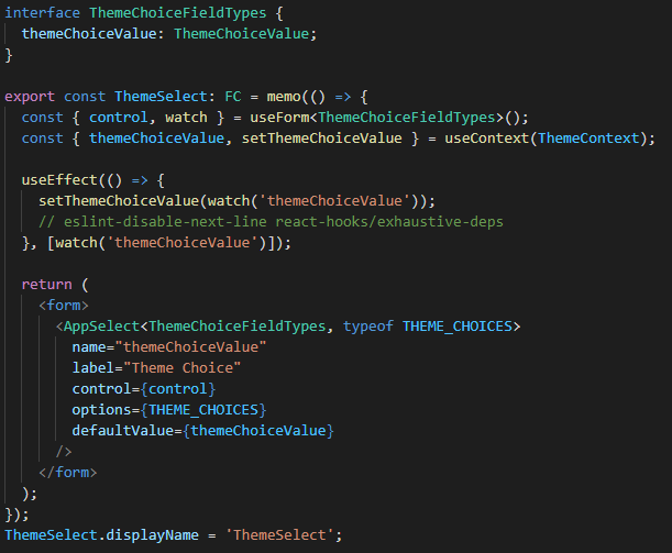
Typescript Generics
Note that we are passing two Typescript generic type parameters into AppSelect: ThemeChoiceFieldTypes and typeof THEME_CHOICES. How we use those will be described later.
Avoid React Warning
The useEffect hook is necessary in this case because if the setThemeChoiceValue is invoked directly in the body of the functional component, React >= 16.3.0 will complain as follows:
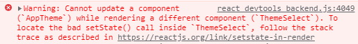
Always separate rendering from updating state. Never change state directly in the body of a functional component.
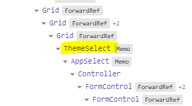
Set component Display Name for a memoized component
ThemeSelect.displayName is set at the bottom of the component. This ensures that this memoized component will be visible in the React Dev Tools Component tab. We also do the exact same thing in AppSelect itself as we will see later.
Implementation of AppSelect
The code below describes the implementation of AppSelect or you can view the complete file on this gist.
Props with Generics
The props of our AppSelect component are set up as follows. If you are not familiar with Typescript generics syntax, what is happening here is we are passing two generic type parameters into the props. There might be a better way to do what I’m trying to do, but this works for me. FormFieldTypes comes from RHF. AppSelectOptions comes from the array of label/value objects that define the options of the select.
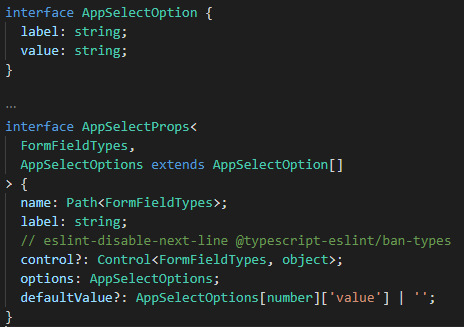
The extends AppSelectOption[] seems to be necessary in order to correctly type the defaultValue. If there is a better way to do this, pls let me know.
We disable the ban-types lint rule in this case, because ban-types complains about using object:
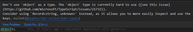
However, that suggestion won’t work because RHF uses object for typing its control prop. And, anyway, it’s completely irrelevant in this case.
name is the machine name of the field. It is a form-level configuration that must get passed down to the Controller component. Don’t get it confused with label which is what the human user sees.
UnmemoizedAppSelect function heading
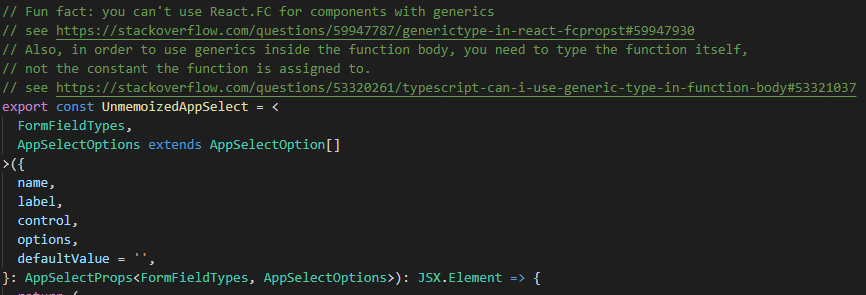
This function heading has a lot to unpack here. First, as the comment says, we cannot use React.FC for functional components that consume generics. See https://stackoverflow.com/questions/59947787/generictype-in-react-fcpropst#59947930
Second, as the comment also says, in order to consume generics in the function body, it is necessary to type the function itself, not the const the function is assigned to, which is normal practice. See https://stackoverflow.com/questions/53320261/typescript-can-i-use-generic-type-in-function-body#53321037
This makes understanding this function header hard to understand. Essentially what is going on is that the component accepts two generic types as parameters, and passes them along to the props. Like above, the extends AppSelectOption[] seems to be necessary in order to enforce the same type as what the props need.
Keep the Component Controlled
Note that we set a default value for defaultValue to empty string. This is necessary to avoid a warning:
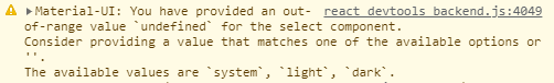
And another warning once a value is selected:

If defaultValue is set to undefined, React assumes this select component is “uncontrolled” and subsequently when it is set, it switches to “controlled”. RHF supports both controlled and uncontrolled components, but Material UI requires the component to be controlled.
UnmemoizedAppSelect function body
Controller is imported from RHF. FormControl, InputLabel, Select, and MenuItem are imported from Material UI.
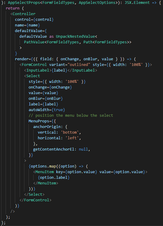
defaultValue prop is given the complex type it demands. It could have more easily been set to any but that wouldn’t be cool, would it?
label is used twice. I’m a little sad about that, but it seems to work the way I want with the outlined FormControl.
The field argument of render prop function is destructured to give us variables to pass to the Select component. A lot of example code will spread props (e.g. {…field}) instead of doing each prop explicitly. Spreading props is common in both the Material UI and RHF community. Alas, I am a non-conformist, and I will only spread props as a last resort, and it doesn’t seem necessary here.
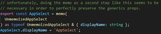
Let’s memoize the component
The final block of code actually builds the AppSelect component itself. Normally, you would see a memoized component simply wrapped around the unmemoized component, but that doesn’t seem to work if your component requires generics.
Weirdly, copying the type exactly from the unmemoized component has the side-effect that Typescript doesn’t know about the displayName property, and we have to explicitly expand the type to include it.
Wrapping it up
And there you have it, a fully memoized and generic AppSelect component, built off Material UI and compatible with RHF. Future work could include:
- displaying error messages,
- more UI customization
- integration with Material UI theme. style attribute is often suboptimal.
- disabled mode
- use a custom options component (e.g. with icons)
- research to see if we can eliminate the second generics prop, which seems like it could be somehow inferred from typeof options
- find a way to make the generics props optional
- unit testing