
SUMMARY:
Lawrence Behar outlines a professional workflow to automate the synchronization of design styles by using Style Dictionary to transform Figma design tokens into usable Tailwind CSS configurations within a Next.js environment.
- Developers utilize the Design Tokens Figma plugin to export color and typography styles as JSON files that serve as a common language between design and code.
- The Style Dictionary watcher script, powered by Chokidar, automatically detects token updates and regenerates the necessary JavaScript modules for the application.
- Custom parsing functions convert raw token data into rem and em units, allowing the Tailwind configuration to dynamically extend themes with precise design system values.
- The final integration involves importing parsed tokens into the
tailwind.config.jsfile and applying them via Tailwind’s@applydirective to ensure global stylistic consistency.
Adopting this automated pipeline eliminates manual copy-pasting, reduces human error, and ensures that the codebase remains perfectly aligned with the evolving design system.
Table of contents
- SUMMARY:
- Figma Design System to Nextjs/Tailwind Using Style Dictionary: Tools Used
- Figma Design System to Nextjs/Tailwind Using Style Dictionary: Setting Up Our Foundation
- Figma Design System to Nextjs/Tailwind Using Style Dictionary: Creating the Design System/Tokens In Figma
- Figma Design System to Nextjs/Tailwind Using Style Dictionary: Integrating the Token Into Tailwind
- Figma Design System to Nextjs/Tailwind Using Style Dictionary: Let’s Goooo!
As a UI developer, we’ve all been there, clicking on every color and typographic style in the Figma Inspector and copying/pasting properties into your Tailwind config file. What if there was a better way? With design tokens, now there is!
Design tokens are a common language that can be spoken by design and development software. Here’s how we can integrate them in a Next.js/TailwindCSS project.
Here are the apps that we’re going to create:
Design Token to Tailwind Next.js app
Note: As long as you are running TailwindCSS and ReactJS, having your app run on Next.js is not required. However, I highly recommend Next.js for its sheer speed thanks to hybrid server side generation approach, image optimization API, and more.
Figma Design System to Nextjs/Tailwind Using Style Dictionary: Tools Used
Figma – A spectacular UX Design tool. In my humble opinion Figma’s auto-layout and collaborative features put it comfortably at the head of the pack.
Design Tokens | Figma Community – An excellent plugin that exports Figma color/typography into a design tokens, which is a JSON file that Style Dictionary can parse. You can export design tokens to a file or sync to Github.
Style Dictionary – Converts design tokens to multiple formats, including JS, CSS, Android, and iOS native files. In this example we’re exporting to a commonJS module. Style once, use everywhere!
Next.js – The React Framework for Production – “Next.js gives you the best developer experience with all the features you need for production: hybrid static & server rendering”
Tailwind CSS – “A utility-first CSS framework packed with classes like flex, pt-4, text-center and rotate-90 that can be composed to build any design, directly in your markup.”
daisyUI – “The most popular, free and open-source Tailwind CSS component library.” Create fully styled cards, alerts, carousels, form fields, and more. with vanilla html elements and a Tailwind class. I prefer it over Material UI because it simply applies css instead of manipulating the dom elements.
Other NPM Modules
Chokidar – “Minimal and efficient cross-platform file watching library.”
Lodash.kebabcase – A Lodash utility that converts strings to kebab case
Now that we have our tools lined up, let’s get to work!
Figma Design System to Nextjs/Tailwind Using Style Dictionary: Setting Up Our Foundation
There are 3 main components here: Figma, the Style Dictionary, and the Next.js app. We’re going to assume that you have Figma installed. If you haven’t yet, the Figma download link is below for your convenience.
Next.js
Make sure you have next.js, Tailwind, @tailwind/typography, and daisyUI installed and configured.
Install Tailwind CSS with Next.js
@tailwindcss/typography – Tailwind CSS
Install daisyUI as a Tailwind CSS plugin
Next, we are going to need lodash.kebabcase.
$ npm install lodash.kebabcaseFinally, we’re going to create a folder in the project root called design-tokens. This is where style-dictionary is going to put the design tokens.
Style Dictionary
First, let’s install the libraries we’ll be using.
$ mkdir style-dictionary && cd style-dictionary
$ npm install --save-dev style-dictionary chokidar
Now create a folder named projects and a subfolder that corresponds with your project name. This is where we’re going to put our tokens and config files.
Here’s my config.json file inside of projects/myapp. In this case we’re only building a commonJS module, and it’s going straight into our Next.js app’s path.
{
 "source": ["./*.tokens.json"],
 "platforms": {
   "js": {
     "transformGroup": "js",
     "buildPath": "../../../myapp/design-tokens/",
     "files": [{
       "destination": "design-tokens.js",
       "format": "javascript/module"
     }]
   }
 }
}
./projects/myapp/config.json
Now let’s create a watch script in the project root. This will watch for any file system change in the ./projects folder and run style-dictionary if a *.token.json file is added or changed. It doesn’t matter how many projects you have, you only need one watch script running.
const { exec } = require("child_process");
const chokidar = require('chokidar');

const runStyleDictionary = (event, path) => {
   // get directory of file changed
   const dir = `./${path.split("/").slice(0, -1).join("/")}`;
   // Run style dictionary on that directory's config.json
   exec(`cd ${dir} && style-dictionary build`, (error, stdout, stderr) => {
       if (error) {
           console.log(`error: ${error.message}`);
           return;
       }
       if (stderr) {
           console.log(`stderr: ${stderr}`);
           return;
       }
       console.log(`stdout: ${stdout}`);
   });
}

chokidar.watch('./projects').on('all', (event, path) => {
   if(["add","change"].includes(event) && path.includes("tokens.json")) {
       runStyleDictionary(event,path);
   }
});
./watch.js
Now we’re going to create an npm script in your package.json. Your package.json file should look like this:
{
 "devDependencies": {
   "chokidar": "^3.5.3",
   "style-dictionary": "^3.7.1"
 },
 "scripts": {
   "watch": "node watch.js"
 }
}
./package.json
Finally, run npm run watch in a terminal window and leave it open.
Figma Design System to Nextjs/Tailwind Using Style Dictionary: Creating the Design System/Tokens In Figma
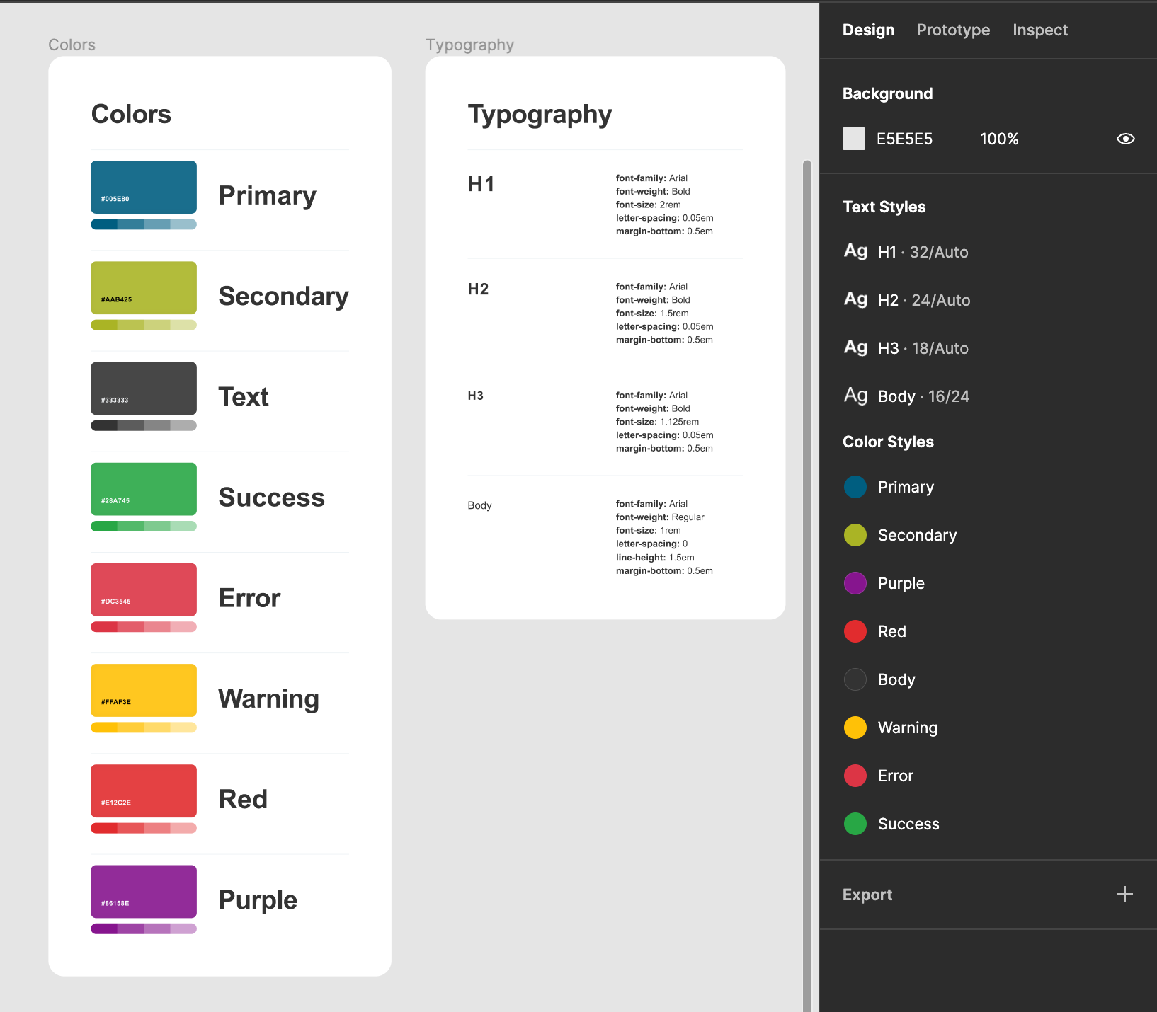
Creating the Design System
For this article, we’re going to keep our system constrained to colors and typography. Create your color swatches and typographic elements. Be sure to save them as color and text styles respectively, since those are being exported.
Feel free to use my example Figma Design System.
Generating Tokens
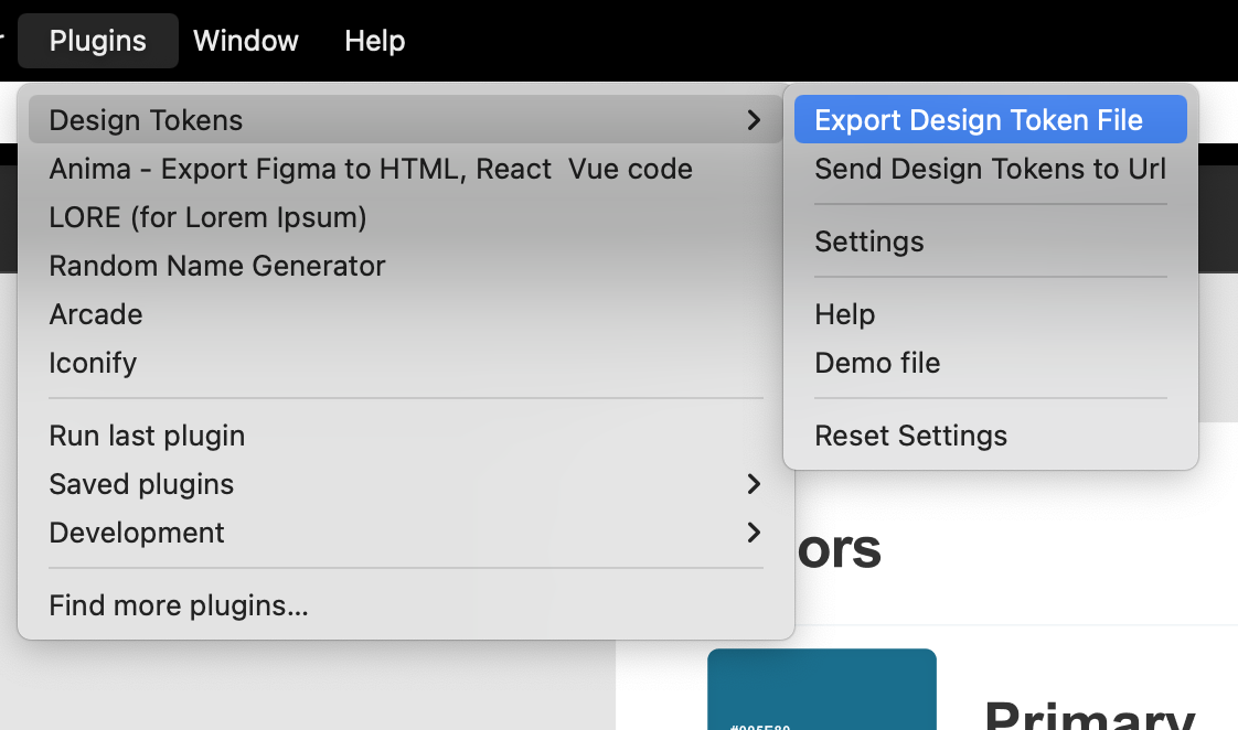
Here’s where the Figma plugin comes into play. If it’s not installed, I’ve included the link again: Design Tokens | Figma Community
Exporting Figma styles to tokens is easy. Go to Plugins -> Design Tokens -> Export Design Token File and choose the style-dictionary project folder to save into. Make sure that the filename ends with tokens.json or our style dictionary watcher will not pick it up! The plugin should provide an *tokens.json filename by default.
Check the style-dictionary console from earlier. You should see something like this:
✔︎ ../myapp/design-tokens/design-tokens.jsThat means that the design token is generated and we’re ready to configure Tailwind! Generating the style token first allows us to test our code right away.
Figma Design System to Nextjs/Tailwind Using Style Dictionary: Integrating the Token Into Tailwind
Note: I took Michael Mangialardi’s blog post on how to integrate color design tokens and extended it to include typography. His blog post is here: Integrating Design Tokens With Tailwind · Michael Mangialardi
Open your Next.js app in your favorite IDE. The first thing we want to do is check the design-tokens folder and make sure that design-tokens.js is in there. Open it and make sure your font and color styles are in there.
Once we’re sure that everything was brought in correctly, let’s make a new file in the design-tokens folder called parsed-tokens.js. We’re creating a design token to tailwind config object adapters of sorts. It’s going to be a commonJS module so the tailwind config file can read it.
I’ll paste the finished file, then break it up and explain it.
const kebabCase = require('lodash.kebabcase');
const tokens = require('./design-tokens');
const sanitizeClass = (className) => className.toLowerCase().replace(/[^a-z0-9]/gi, '')
const colors = Object.fromEntries(Object
 .values(tokens.color)
 .map(({ attributes, value }) => [
   kebabCase(attributes.type), value
 ])
);
const fontSize = Object.fromEntries(Object
 .values(tokens.font)
 .map(({ attributes, value }) => [
   sanitizeClass(attributes.type), [`${value.fontSize / 16}rem`, {
     letterSpacing: `${value.letterSpacing / value.fontSize}em`,
     lineHeight: `${value.lineHeight / value.fontSize}em`,
   }]
 ])
);
const fontFamily = Object.fromEntries(Object
 .values(tokens.font)
 .map(({ attributes, value }) => [
   sanitizeClass(attributes.type), `${value.fontFamily}, Arial, Helvetica, sans-serif`
 ])
);
const margin = Object.fromEntries(Object
 .values(tokens.font)
 .map(({ attributes, value }) => [
   sanitizeClass(attributes.type), `${value.paragraphSpacing / value.fontSize}em`,
 ])
);
module.exports = { colors, fontFamily, fontSize, margin }
design-tokens/parsed-tokens.js
First, let’s pull in our token and lodash’s kebab-case converter.
design-tokens/parsed-tokens.js:1-2 (incomplete file)
const kebabcase = require('lodash.kebabcase');
const tokens = require('./design-tokens');
design-tokens/parsed-tokens.js:3 (incomplete file)
const sanitizeClass = (className) => className.toLowerCase().replace(/[^a-z0-9]/gi,Colors
Since we’re importing into Tailwind’s config file, unfortunately we have to use the CommonJS Module format, which is a little messier than the ES6 format. Here’s a color from the design tokens file.
/**
* Do not edit directly
* Generated on Thu, 01 Sep 2022 23:24:43 GMT
*/

module.exports = {
 "color": {
   "primary": {
     "description": "",
     "type": "color",
     "value": "#005e80",
     "blendMode": "normal",
     "extensions": {
       "org.lukasoppermann.figmaDesignTokens": {
         "styleId": "S:912454190ee23ce2bf9f3e028774ed7581a7c683,",
         "exportKey": "color"
       }
     },
     "filePath": "./myapp.tokens.json",
     "isSource": true,
     "original": {
       "description": "",
       "type": "color",
       "value": "#005e80ff",
       "blendMode": "normal",
       "extensions": {
         "org.lukasoppermann.figmaDesignTokens": {
           "styleId": "S:912454190ee23ce2bf9f3e028774ed7581a7c683,",
           "exportKey": "color"
         }
       }
     },
     "name": "ColorPrimary",
     "attributes": {
       "category": "color",
       "type": "primary"
     },
     "path": [
       "color",
       "primary"
     ]
   },
design-tokens/design-tokens.js:1-42
And here’s how we’re parsing
const colors = Object.fromEntries(Object
 .values(tokens.color)
 .map(({ attributes, value }) => [
   kebabcase(attributes.type), value
 ])
);
design-tokens/parsed-tokens.js:4-9
Let’s go through the process. If you want a more detailed walkthrough, Michael’s blog post referenced above does a spectacular job.
- Object.fromEntries converts an array into a key/value pair, allowing us to have a dynamically generated key without a whole ordeal.
- Object.values returns an array of the color object’s values so we can use map to iterate through them. We lose the key as a side effect, but fortunately the color name is elsewhere in the object.
- The parameter in our map function is a destructured object with the “value” and “attributes” props. I’ve highlighted them above because I realize there are a bunch of duplicate key names here.
- Figma’s naming conventions are straight from the wild west. The lodash.kebabcase function converts whatever Figma generates into a predictable dash-separated lowercase value with no spaces or special characters. For example, this lovely color name would be converted to “big-money-green”.

Fonts
Here’s the font object that we’re going to be working off of. Here’s how the h1 font looks.
 "font": {
   "h1": {
     "type": "custom-fontStyle",
     "value": {
       "fontSize": 32,
       "textDecoration": "none",
       "fontFamily": "Arial",
       "fontWeight": 700,
       "fontStyle": "normal",
       "fontStretch": "normal",
       "letterSpacing": 1.6,
       "lineHeight": 38.4,
       "paragraphIndent": 0,
       "paragraphSpacing": 16,
       "textCase": "uppercase"
     },
     "extensions": {
       "org.lukasoppermann.figmaDesignTokens": {
         "styleId": "S:a93bcd5f46372ad50fb77d651d0807c09f7a0d9d,",
         "exportKey": "font"
       }
     },
     "filePath": "./myapp.tokens.json",
     "isSource": true,
     "original": {
       "type": "custom-fontStyle",
       "value": {
         "fontSize": 32,
         "textDecoration": "none",
         "fontFamily": "Arial",
         "fontWeight": 700,
         "fontStyle": "normal",
         "fontStretch": "normal",
         "letterSpacing": 1.6,
         "lineHeight": 38.4,
         "paragraphIndent": 0,
         "paragraphSpacing": 16,
         "textCase": "uppercase"
       },
       "extensions": {
         "org.lukasoppermann.figmaDesignTokens": {
           "styleId": "S:a93bcd5f46372ad50fb77d651d0807c09f7a0d9d,",
           "exportKey": "font"
         }
       }
     },
     "name": "FontH1",
     "attributes": {
       "category": "font",
       "type": "h1"
     },
     "path": [
       "font",
       "h1"
     ]
   },
design-tokens/design-tokens.js:289-344
Font Size
const fontSize = Object.fromEntries(Object
 .values(tokens.font)
 .map(({ attributes, value }) => [
   sanitizeClass(attributes.type), [`${value.fontSize / 16}rem`, {
     letterSpacing: `${value.letterSpacing / value.fontSize}em`,
     lineHeight: `${value.lineHeight / value.fontSize}em`,
   }]
 ])
);
design-tokens/parsed-tokens.js:10-18
Tailwind wraps font-size, letter-spacing, and line-height into one configuration item. Here’s a link to the configuration Font Size – Tailwind CSS.
Unfortunately there are no rem/em units in Figma. Fortunately converting them to the proper units is simple. Font-size is in rem units, and letter-spacing/line-height are in em units which are relative to the font size of the element.
You’ll also notice that I’m using a custom sanitizeClass instead of kebab-case. To reiterate what I stated earlier, kebab-case was converting h1 to h-1 so I added a quick regex replace that won’t add dashes. Here it is again for reference.
const sanitizeClass = (className) => className.toLowerCase().replace(/[^a-z0-9]/gi, '')design-tokens/parsed-tokens.js:3
Font Family
Important: This script will not import/install web fonts for you.
const fontFamily = Object.fromEntries(Object
 .values(tokens.font)
 .map(({ attributes, value }) => [
   sanitizeClass(attributes.type), `${value.fontFamily}, Arial, Helvetica, sans-serif`
 ])
);
design-tokens/parsed-tokens.js:19-24
Font-family is coming from the same object as font-size, so the process is very similar. However, unlike the conversion required for font-size, only thing we need to do is supply default web fonts. I’m not personally concerned about whether it’s a serif or a sans because ideally we’ll never see these fallback fonts.
Margin
const margin = Object.fromEntries(Object
 .values(tokens.font)
 .map(({ attributes, value }) => [
   sanitizeClass(attributes.type), `${value.paragraphSpacing / value.fontSize}em`,
 ])
);
design-tokens/parsed-tokens.js:25-30
We’re taking Figma’s paragraph spacing and converting it to margin-bottom, so we need that value stored here. This is the most straightforward function of the lot.
Export
module.exports = { colors, fontFamily, fontSize, margin }Finally, we’re exporting these parsed values so we can import them in our Tailwind configuration file.
Importing Into tailwind.config.js
Before we break things down, here is the completed file.
tailwind.config.js
/** @type {import('tailwindcss').Config} */
const {colors, fontFamily, fontSize, margin} = require('./design-tokens/parsed-tokens')
module.exports = {
 content: [
   "./pages/**/*.{js,ts,jsx,tsx}",
   "./components/**/*.{js,ts,jsx,tsx}",
   "./forms/**/*.{js,ts,jsx,tsx}",
 ],
 theme: {
   extend: {
     colors: Object.assign(colors, {
       "white": "#ffffff",
     }),
     fontSize,
     fontFamily,
     margin,
   },
 },
 daisyui: {
   themes: [
     {
       mytheme: {
         "primary": colors.primary || "#570DF8",
         "secondary": colors.secondary || "#F000B8",
         "accent": colors.accent || "#37CDBE",
         "neutral": colors.neutral || "#3D4451",
         "base-100": colors["base-100"] || "#FFFFFF",
         "info": colors.info || "#3ABFF8",
         "success": colors.success || "#36D399",
         "warning": colors.warning || "#FBBD23",
         "error": colors.error || "#F87272",
       },
     },
   ],
 },
 plugins: [
   require('@tailwindcss/typography'),
   require("daisyui"),
 ],
}
So what have I added?
The parsedToken module
const {colors, fontFamily, fontSize, margin} = require('./design-tokens/parsed-tokens')Extending the Tailwind theme
 theme: {
   extend: {
     colors: Object.assign(colors, {
       "white": "#ffffff",
     }),
     fontSize,
     fontFamily,
     margin,
   },
 },
We already did the hard work in our other file, so this part is easy! If you want to add other utility classes just use Object.assign like I did for colors.
Extending the DaisyUI theme
 daisyui: {
   themes: [
     {
       mytheme: {
         "primary": colors.primary || "#570DF8",
         "secondary": colors.secondary || "#F000B8",
         "accent": colors.accent || "#37CDBE",
         "neutral": colors.neutral || "#3D4451",
         "base-100": colors["base-100"] || "#FFFFFF",
         "info": colors.info || "#3ABFF8",
         "success": colors.success || "#36D399",
         "warning": colors.warning || "#FBBD23",
         "error": colors.error || "#F87272",
       },
     },
   ],
 },
DaisyUI has its own special theme that it uses to style components. If you have experience with Bootstrap or Material UI you’re familiar with these names.
If the color does not exist, the fallback values provided are from daisyUI’s default theme, feel free to replace the fallbacks, here are some themes if you want inspiration https://daisyui.com/docs/themes/
Applying typography classes to elements
./styles/globals.css:11-16
body {
 @apply prose font-body text-body;
 @apply prose-h1:font-h1 prose-h1:text-h1 prose-h1:mt-0;
 @apply prose-h2:font-h2 prose-h2:text-h2 prose-h2:mt-0;
 @apply prose-h3:font-h3 prose-h3:text-h3 prose-h3:mt-0;
}
I applied Tailwind’s typography to the entire document body, but you can be a bit more granular if you want.
The prose classes belong to Tailwinds’ typography plugin. It’s a little unorthodox but very well documented and affords elegant customizability. Here’s the documentation: @tailwindcss/typography – Tailwind CSS
Important – @apply throws an error when an included Tailwind class does not exist. If h1, h2, h3, or body text styles were missing this would not build. I consider this a good thing in this case because if those universal styles are not applied we will know right away.
Note – Even though I only used h1, h2, h3, and body typography styles in this example, any typography style name will be added to the Tailwind config and will be available as utility classes. For example, your text style spooky will be available as .text-spooky (font-size, letter-spacing, etc), .font-spooky (font-family) and .mb-spooky (margin)
Figma Design System to Nextjs/Tailwind Using Style Dictionary: Let’s Goooo!
Here’s a quick proof of concept to show it works. Just go to your Next.js app directory in your favorite terminal and type yarn dev. This will spin up a local environment.
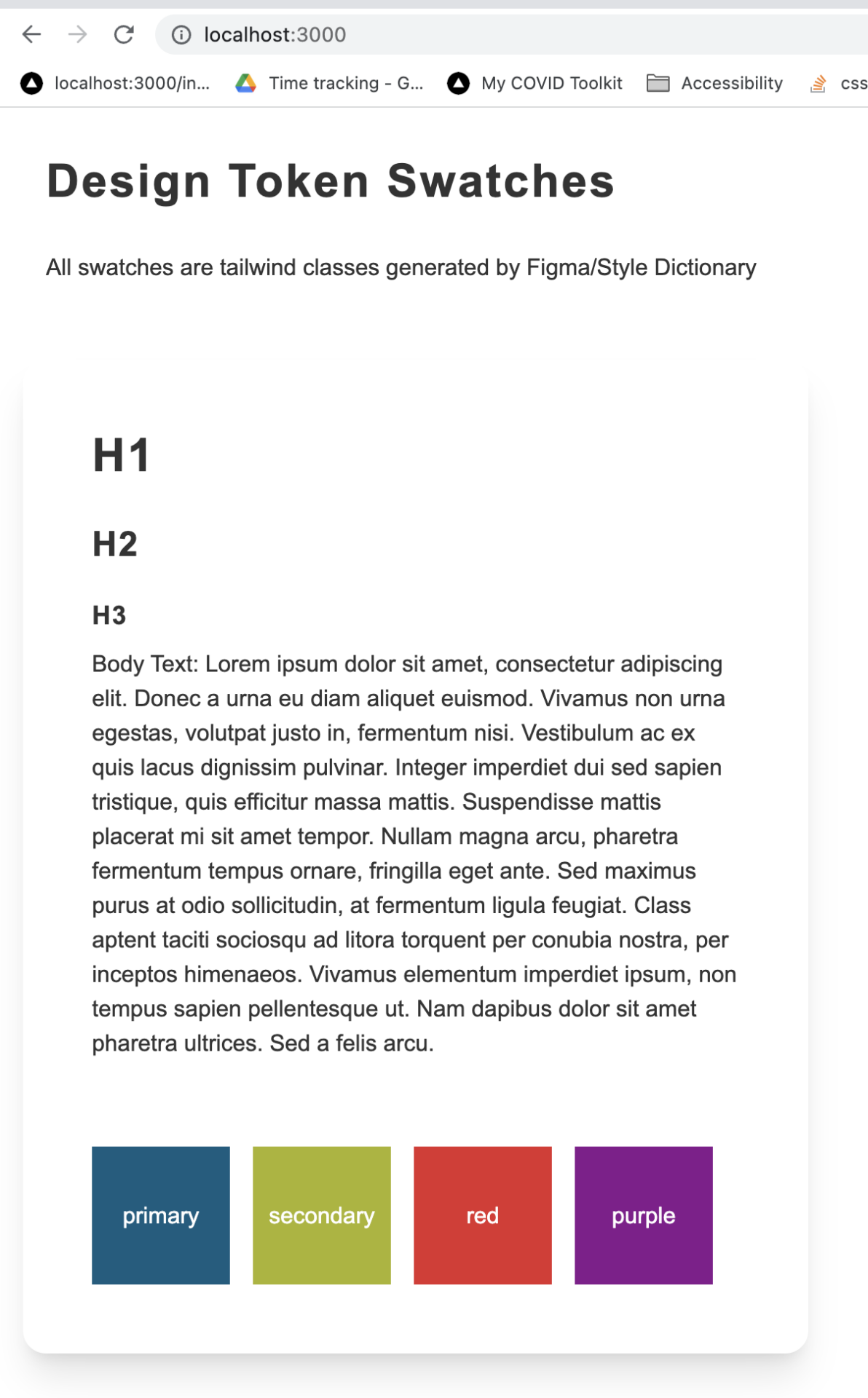
Here is the corresponding code. Nothing fancy here!
var cn = require('classnames');
import React from 'react';
const TokenTest = () => {

   const swatchClass = 'flex items-center justify-center w-24 h-24 text-center text-white';
   return (<div className='p-4'>
       <div className='p-4'>
       <h1>Design Token Swatches</h1>
       <p>All swatches are tailwind classes generated by Figma/Style Dictionary</p>
       </div>
       <div className='my-4 shadow-xl card'>
           <div className='card-body'>
               <div className='p-4'>
                   <h1>H1</h1>
                   <h2>H2</h2>
                   <h3>H3</h3>
                   <p>Body Text: Lorem ipsum dolor sit amet, consectetur adipiscing elit. Donec a urna eu diam aliquet euismod. Vivamus non urna egestas, volutpat justo in, fermentum nisi. Vestibulum ac ex quis lacus dignissim pulvinar. Integer imperdiet dui sed sapien tristique, quis efficitur massa mattis. Suspendisse mattis placerat mi sit amet tempor. Nullam magna arcu, pharetra fermentum tempus ornare, fringilla eget ante. Sed maximus purus at odio sollicitudin, at fermentum ligula feugiat. Class aptent taciti sociosqu ad litora torquent per conubia nostra, per inceptos himenaeos. Vivamus elementum imperdiet ipsum, non tempus sapien pellentesque ut. Nam dapibus dolor sit amet pharetra ultrices. Sed a felis arcu.</p>
               </div>
               <div className='flex gap-4 p-4 '>
                   <div className={`${swatchClass} bg-primary`}>primary</div>
                   <div className={`${swatchClass} bg-secondary`}>secondary</div>
                   <div className={`${swatchClass} bg-red`}>red</div>
                   <div className={`${swatchClass} bg-purple`}>purple</div>
               </div>
           </div>
       </div>
   </div>)
}
export default TokenTest;
If you end up using this we’d love to hear about how you implemented it. Feel free to leave a comment below!