A requirement that is often found in enterprise IT environments is the need for “dashboards” that provide integrated, highly visual (e.g., chart-driven) representations of key data to executives, analysts and key decision makers. In addition to the data visualization requirements for these dashboards, there are typically security requirements (e.g., RBAC) around “who can see what”.
There are a number of products available in the marketplace today that support the development of such dashboards; however there are often several key limitations associated with building these dashboards with these “dashboard-only” types of products:
(1) The created dashboards are often generated in a “standalone” manner and are not easily integrated with other key MIS systems in use
(2) The implementation of the security requirements often requires the development of multiple instances of the dashboard where the security/access requirements are statically “baked in” or assigned to each unique instance
One of the great strengths of any portal server, and Liferay in particular, is the ease with which “at the glass” data integration and human collaboration across the entire enterprise can be accomplished. Typically we think of this integration in terms of traditional portlet “applications” (e.g., forms, lists, tables, etc.), but recently XTIVIA has developed a solution framework for one of its clients that shows how Liferay can also be used to develop powerful dashboard applications that are portlet-based, configuration-driven (XML), and equivalent in capability to those typically developed with standalone dashboard products. This provides a very powerful metaphor for integrating the analytics of dashboards with the collaboration features of the portal environment.
This blog post will provide a description of the dashboard framework that Xtivia has successfully implemented for one of its clients. This initial post will provide a general overview of the framework and its capabilities; a second blog post will describe how access control is implemented in the framework.
Part 1: An overview of the dashboard framework for data warehouse
The first key goal is to provide a framework that is reusable and supports customization of the interfaces/components in order to enhance the dashboard page solution development in Liferay.
One of the key elements of this framework is that is completely reusable and metadata-driven via an XML file. The REST services that deliver the data feeds as well as the information sets (facts and dimensions) that are made available to portlets are completely configurable via the XML file.
In our solution we create an instanceable chart portlet so that we can put as many portlet instances as desired on a dashboard page. Each portlet instance renders a different data chart based on a different set of configurations. Generally there are two types of configurations: chart configurations and data feed service configurations. Chart configurations contain the chart type, the chart size, the chart category and series and other chart related settings. Data feed service configurations contain all the chart data related information, including where to fetch the data for the chart and which preset filters should be used, basically this information should be chart independent.
Another element of the framework is a controller portlet on the dashboard page. A non-instanceable filter portlet serves as a page scope dashboard controller to apply additional filters to all the chart portlet instances on the page. Based on the combination of the page scope filters and the pre-set filters configured in the data feed service configurations of the chart portlet itself, the chart fetches different sets of data from the data warehouse and renders it on the page.
The last part of the framework is the backend data feed REST services which provide all the required data from the data warehouse to the frontend portlets.
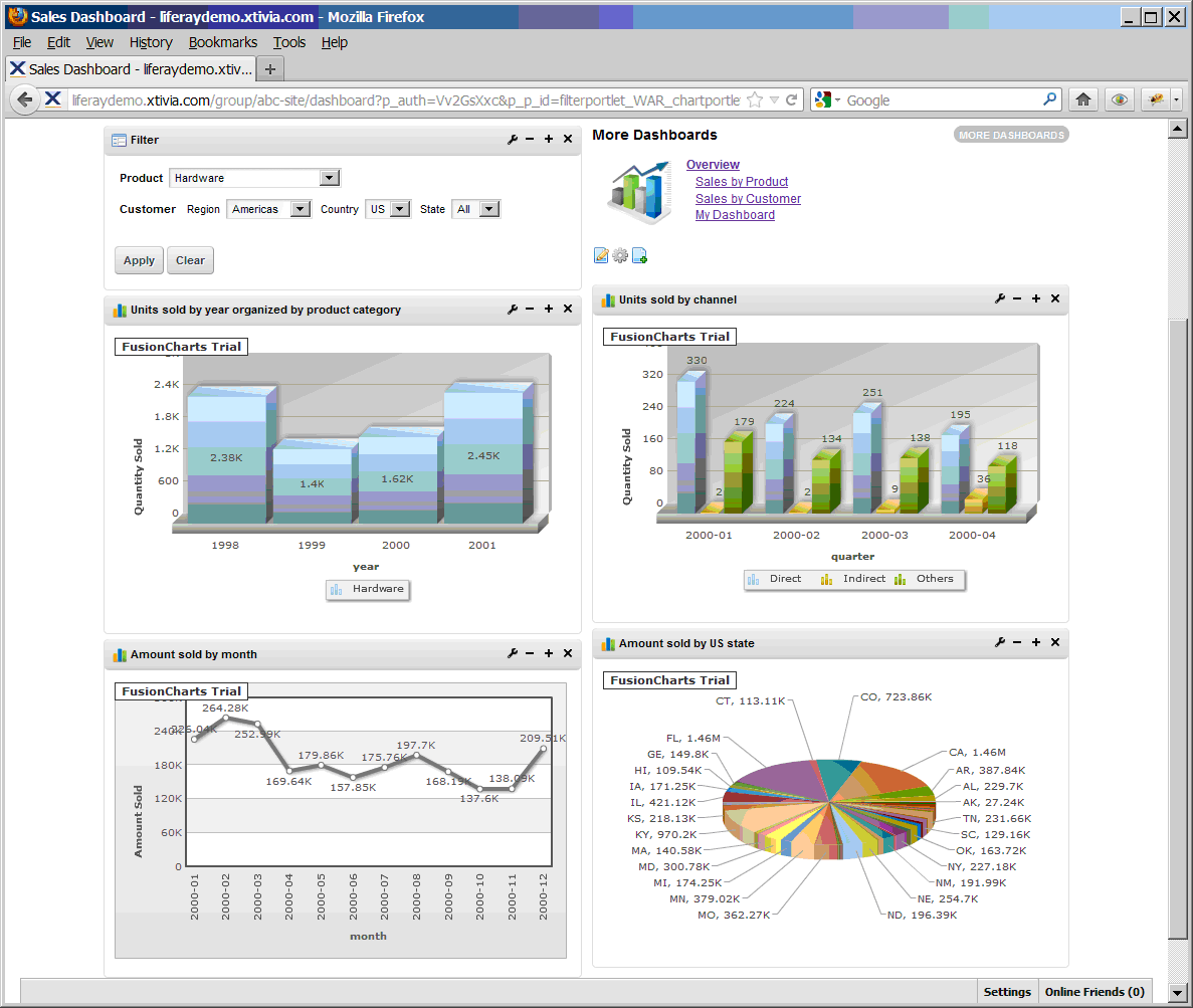
Here’s what a dashboard page looks like:
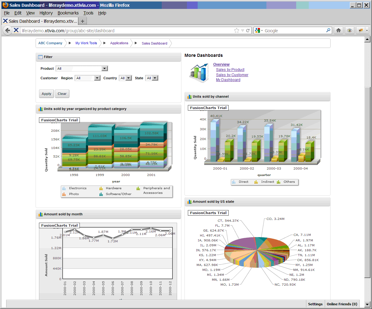
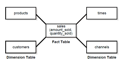
The data source that the sample dashboard is using is a data warehouse. Today there are many different types of data warehouse products on the market. To make it simpler our framework’s data warehouse schema follows the star schema model, which means the center of the star consists of one or more fact tables and the points of the star are the dimension tables, as shown in the following picture:
In dashboard solutions for different clients, they will all have different data warehouses. Based on the star schema of the data warehouse that the client has, there is a set of metadata defined in the dashboard framework which is used for generating the chart configurations and filter definitions. The metadata also serves as a bridge between the frontend portlets and backend data feed services. Here’s a sample of the metadata definition looks like:
<?xml version="1.0" encoding="UTF-8" standalone="yes"?>
<metadata>
<dimensions>
<count>2</count>
<dimension id="customers_dimension">
<dimensionAttribute id="customers_subregion" childAttribute="customers_country">
<columnName>COUNTRY_SUBREGION</columnName>
<hasParent>true</hasParent>
<name>SubRegion</name>
<tableName>COUNTRIES</tableName>
</dimensionAttribute>
<dimensionAttribute id="customers_country" childAttribute="customers_state">
<columnName>COUNTRY_ISO_CODE</columnName>
<hasParent>true</hasParent>
<name>country</name>
<tableName>COUNTRIES</tableName>
</dimensionAttribute>
<dimensionAttribute id="customers_state" childAttribute="customers_city">
<columnName>CUST_STATE_PROVINCE</columnName>
<hasParent>true</hasParent>
<name>state</name>
<tableName>CUSTOMERS</tableName>
</dimensionAttribute>
<dimensionAttribute id="customers_city" childAttribute="customers_customer">
<columnName>CUST_CITY</columnName>
<hasParent>true</hasParent>
<name>city</name>
<tableName>CUSTOMERS</tableName>
</dimensionAttribute>
<dimensionAttribute id="customers_region" childAttribute="customers_subregion">
<columnName>COUNTRY_REGION</columnName>
<hasParent>false</hasParent>
<name>Region</name>
<tableName>COUNTRIES</tableName>
</dimensionAttribute>
<dimensionPKColumName>CUST_ID</dimensionPKColumName>
<dimensionPrimaryTable>CUSTOMERS</dimensionPrimaryTable>
<joinedTableNames>
<entry>
<key>COUNTRIES</key><value>COUNTRY_ID</value>
</entry>
</joinedTableNames>
<name>Customers</name>
</dimension>
<dimension id="products_dimension">
<dimensionAttribute id="product_product_total" childAttribute="product_category">
<columnName>PROD_TOTAL</columnName>
<hasParent>false</hasParent>
<name>product total</name>
<tableName>PRODUCTS</tableName>
</dimensionAttribute>
<dimensionAttribute id="product_category" childAttribute="product_subcategory">
<columnName>PROD_CATEGORY</columnName>
<hasParent>true</hasParent>
<name>category</name>
<tableName>PRODUCTS</tableName>
</dimensionAttribute>
<dimensionAttribute id="product_product">
<columnName>PROD_ID</columnName>
<hasParent>true</hasParent>
<name>product</name>
<tableName>PRODUCTS</tableName>
</dimensionAttribute>
<dimensionAttribute id="product_subcategory" childAttribute="product_product">
<columnName>PROD_SUBCATEGORY</columnName>
<hasParent>true</hasParent>
<name>subCategory</name>
<tableName>PRODUCTS</tableName>
</dimensionAttribute>
<dimensionPKColumName>PROD_ID</dimensionPKColumName>
<dimensionPrimaryTable>PRODUCTS</dimensionPrimaryTable>
<name>Products</name>
</dimension>
</dimensions>
<facts>
<item factName="sales">
<measure>
<columnName>AMOUNT_SOLD</columnName>
<factTableName>SALES</factTableName>
<name>Amount Sold</name>
</measure>
<measure>
<columnName>QUANTITY_SOLD</columnName>
<factTableName>SALES</factTableName>
<name>Quantity Sold</name>
</measure>
<relatedDimensions>
<item>customers_dimension</item>
<item>products_dimension</item>
</relatedDimensions>
</item>
</facts>
</metadata>
The dashboard framework is composed of two Liferay plug-ins. One is the frontend portlet plug-in containing two portlets: a chart portlet and a filter portlet. No changes are required to either of the portlets unless you want to change the look and feel of the portlets themselves. The other plugin provides the data feed service part of the dashboard framework and is implemented as a Liferay web plug-in. You can customize this plug-in to make it work with different data warehouses.
Once the target data warehouse is selected, the metadata xml file can be configured in the Spring application context file in the data feed service web plug-in, and it will be accessible by a REST service URL after it is loaded. In addition to the creation of the metadata xml file, you need to configure the data source of the data warehouse, create the data generator component and the filter generator component. For these two new components, you can just use the default implementation in the framework but wire the new data source configuration to them in Spring configuration file. After the data generator and the filter generator are created and registered, you should be able to see some charts on the page!
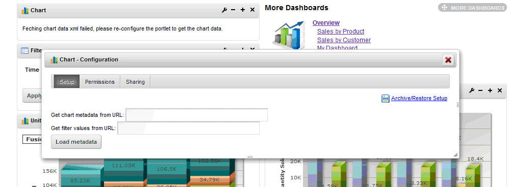
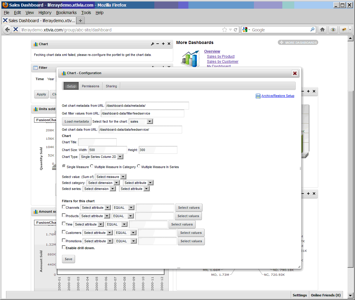
Now let’s talk about how to configure the chart portlet in the dashboard framework on a page. The metadata location and the filter generator service location are the very first things that need to be configured in the portlet so that it can populate all the other configuration fields and filters with available values. While a new chart portlet is added on the page, on the portlet configuration screen, you need to specify these two URLs first:
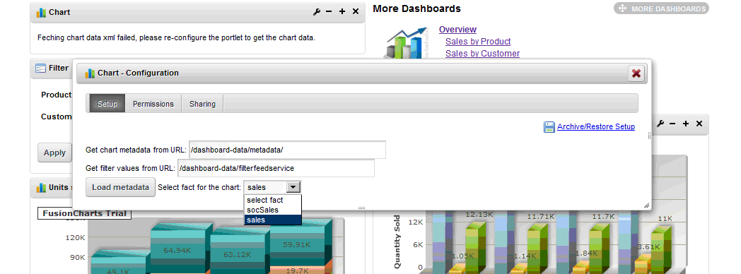
Once these two URLs are specified, click the “Load metadata” button, you will be able to see all the available facts:
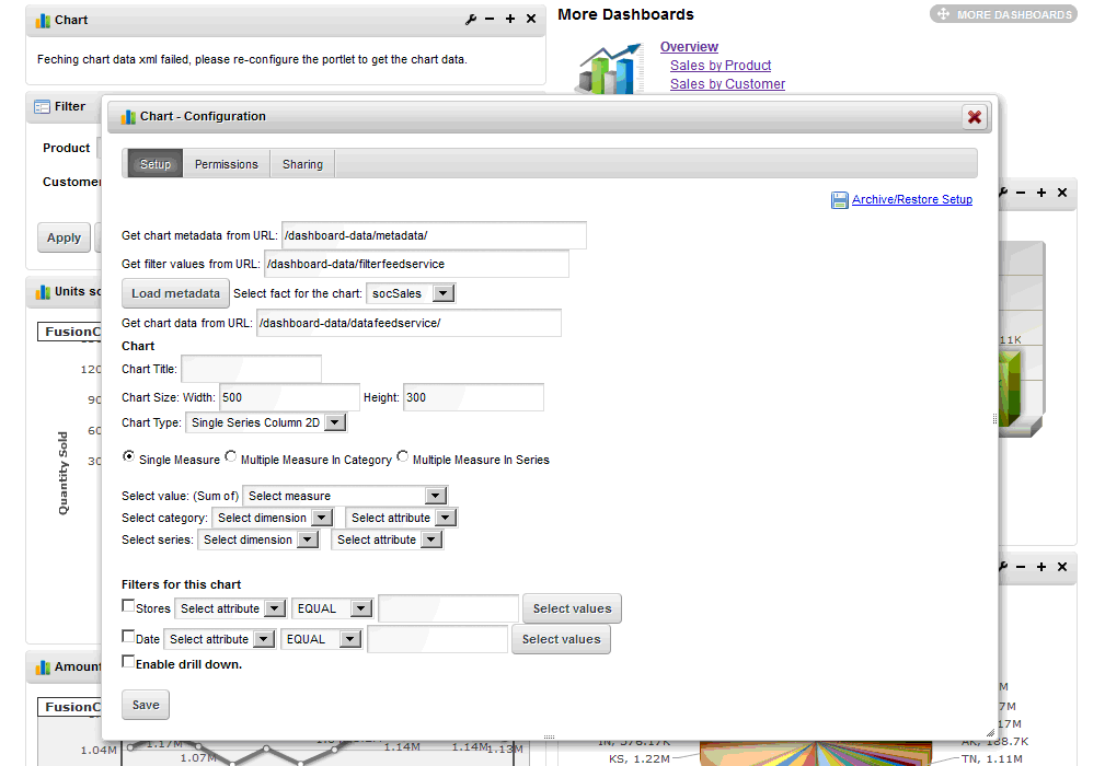
Choose a fact name in the drop down list, the entire chart portlet configuration screen is populated as below:
If you switch to another fact name in the drop down list, a different chart portlet configuration screen is populated:
In the chart portlet configurations, you need to configure the chart data feed service URL, the chart related configurations and the filter related configurations. Once all the configurations are saved, the chart portlet makes call to the backend REST service and get the chart rendering XML to render the chart.
Let’s look at how to configure two sample charts:
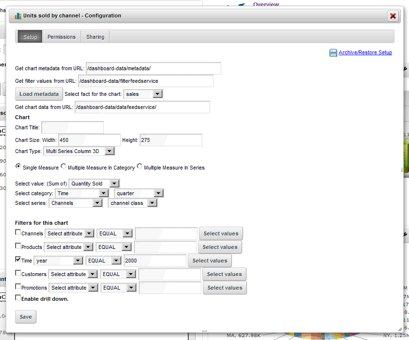
Sample chart 1 is “Units sold by channel” chart. The chart type is a “Multiple Series Column 3D” chart, the chart category is by quarter, the chart series is by channel class and we add a preset filter with the year 2000. So the chart configuration screen looks like this:
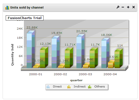
After we save the configurations, the chart renders as below:
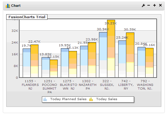
Sample chart 2 is “Today’s sales vs plan” chart. This chart will show two measures in one chart to allow user to do the comparison. The chart type is a “Multiple Series Column 2D” chart, the chart category is by store, the chart series is by “Today’s sales” and “Today’s sales plan” and we add a preset filter with the store district 603. So the chart configuration screen looks like this:

After we save the configurations, the chart renders as below:
As what is shown in these two sample charts, we can perform the same steps but use different portlet configuration settings in different chart portlet instances on the same page so that each chart fetches different data and shows as different chart types and so on.
Currently all the preset filter configurations for each chart are in the page scope, i.e. the data that each portlet is getting from the data feed service will be the same despite what user logs in. What if on the same page, I want to render different charts to different users based on their profiles or their own settings? I will discuss about the personalized charts in the next part of this blog.
After we have configured 4 chart portlets on the dashboard page, let’s add a filter portlet on the same page to set the page scope filters to control all the chart portlets on the page.
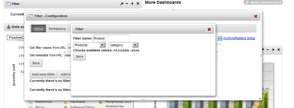
In the filter portlet configurations, again you need to configure the metadata URL and the filter generator service URL first to populate the rest fields of the configuration sections. Then you can add a new filter or a new filter group which is composed of filters based on hierarchical dimension attributes. For instance, you can add a new “product category” filter like this:
You can also add a new “Customer” filter group. First add a filter for the top level dimension attribute and click “Save”:
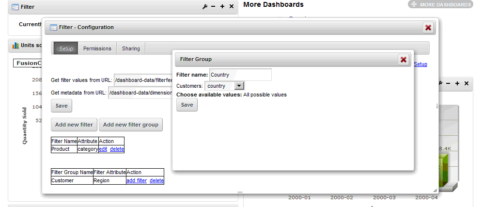
And then add filters for sub level dimension attributes in the filter group:
Finally the filter portlet looks like this:

Until now if the user selects some values in the drop down lists and click “Apply” button, the filters will be applied to all the chart portlets on the dashboard page and the user will be able to see the filtered data on the page.
Once the user clicks “Clear” button, the filters in the filter portlet will not take effect any more, all the chart portlets will revert to their original status with their own preset filter configurations respectively.