More and more of our customers are looking at creating Liferay based portal sites that adapt themselves to different form factor devices ranging from traditional desktop and notebook browsers to tablets to smart phones. Rather than creating separate traditional and mobile device sites, customers are now preferring to create a single site that implements the principles of Responsive Web Design. Recently, I had a chance to work on a project with similar mobile needs that I met using the AUI viewport concept that is available in newer versions of Liferay.
AUI viewport allows you to target your site design to specific device sizes. To enable the module, one must call AUI().use(‘aui-viewport’) in a script tag anywhere on the page.
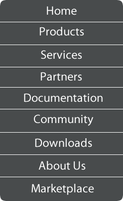
To illustrate, assume you have a navigation section that was displayed horizontally.
![]()
#navigation li { display: inline; float: left;}
To show the same navigation vertically on a device with width of 480 pixels or less we need to put .aui-view-lt480 in front of the css definition.

.aui-view-lt480 #navigation li { display: block; }
The convention used is as follows:
NOTE: {width} = device width in pixels
.aui-view-lt{width}
or
.aui-view-{width}
or
.aui-view-gt{width}
This module is available in Liferay EE 6.0 SP2 and Liferay CE 6.1.
