
This article / e-book is intended for the Product Owner, IT VP/Director/Manager, Enterprise Architect, or Mobile Developer who is tasked with trying to implement a mobile app, and is confused by the multitude of mobile app development approaches out there and the associated pros/cons. In that situation, you need objective, yet expert, information. Even more, you need it from an unbiased perspective. I have kept this in mind while putting this together, although where I have a personal preference or opinion, I share it with that disclaimer.
That said, the right choice for you is going to be dependent on your situation so any potential bias presented here will be largely irrelevant.
The way for you to get the most value for this information is to read through it, note the highlights that are most relevant to your organization, and then answer the questions throughout this piece to help you discern the best decision for your organization.
So grab a cup of coffee (or your favorite beverage) and read on…
Mobility and mobile strategy has been the focus of many CIOs, business owners, and enterprises for many years as a fundamental and significant architectural decision; this technology space has been evolving at a rapid pace with new mobile development tools and frameworks emerging each year. Replatforming your mobile app is quite the endeavor and not for the faint-hearted! Beyond the complexity of choosing one of the numerous mobile app development options available, what makes this decision even more challenging is the fact that what was in vogue yesterday may be frowned upon today by the elitists in the mobile community. This article will walk you through the main mobile app development styles available to you today, then introduce criteria that are important while evaluating the development options, provide a comparison of the development options based on these criteria and, finally, summarize the key takeaways.

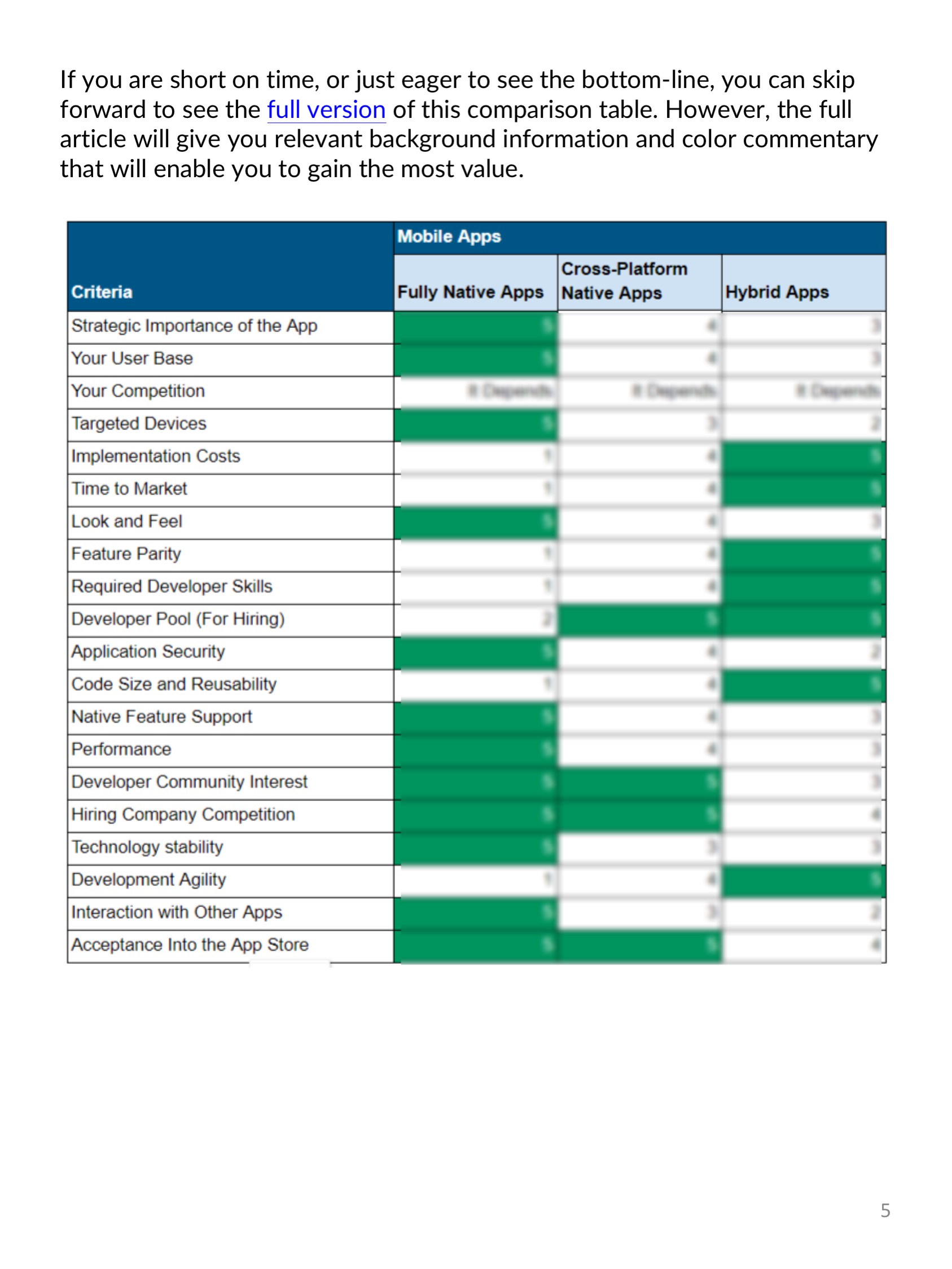
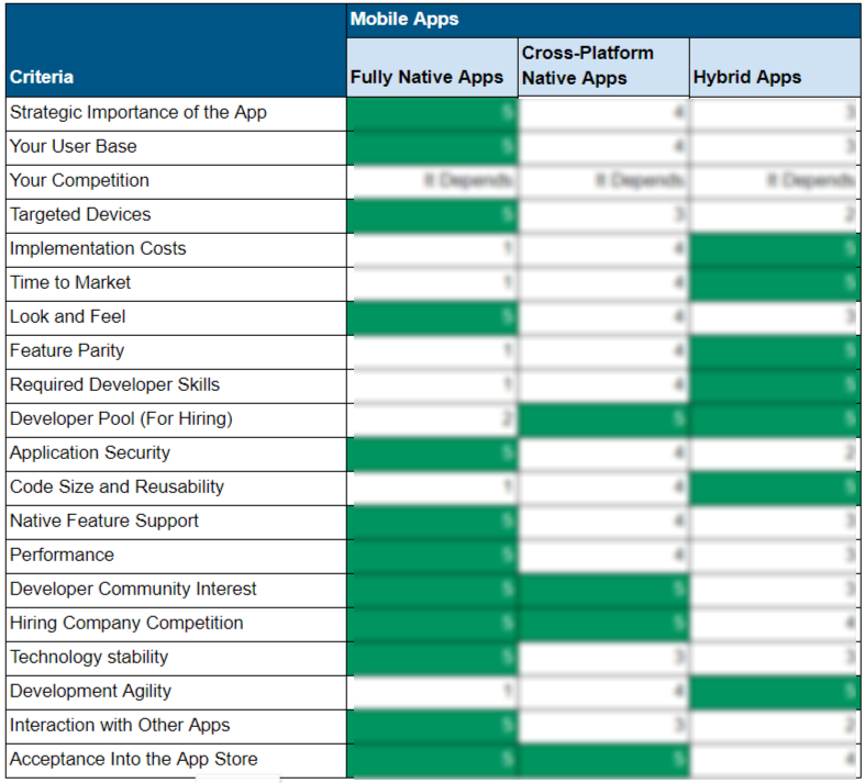
If you are short on time, or just eager to see the bottom-line, you can skip forward to see the full version of this comparison table at the end of the eBook. However, I suggest that you read the full eBook for the relevant background information and color commentary necessary to gain the most value.
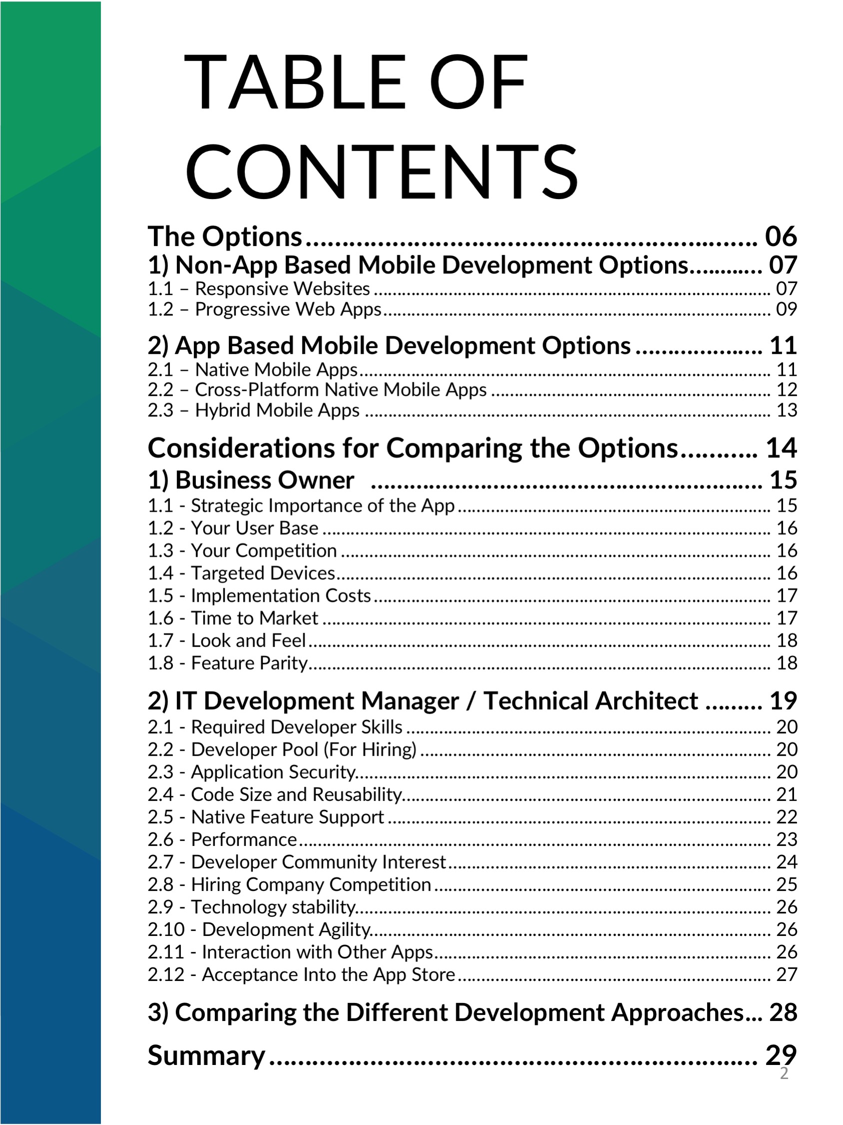
The Options
Following is a description of the three primary mobile app development approaches, though there is some overlap between these approaches and some of the boundaries between them are not all that clear. However, first, let’s cover a couple of mobile development options that don’t involve developing and maintaining mobile apps.
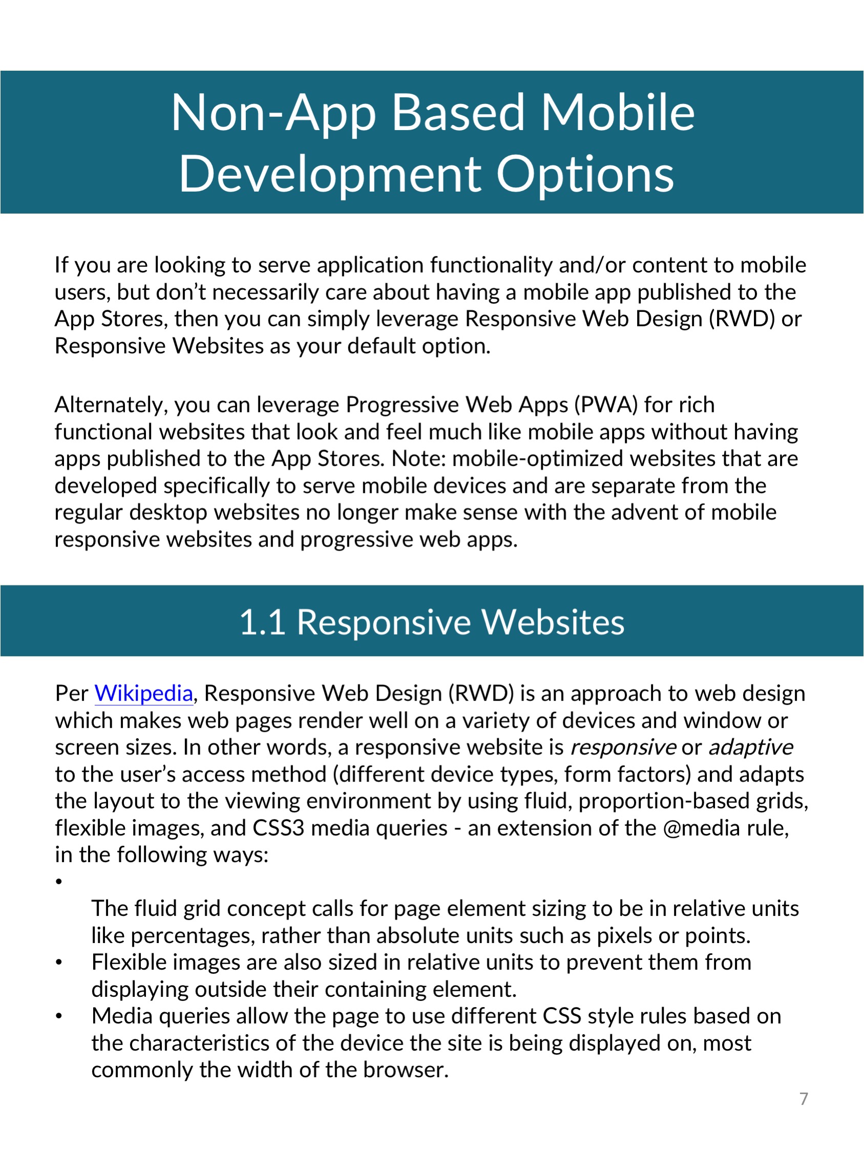
Non-App Based Mobile Development Options
If you are looking to serve application functionality and/or content to mobile users, but don’t necessarily care about having a mobile app published to the App Stores, then you can simply leverage Responsive Web Design (RWD) or Responsive Websites as your default option.
Alternately, you can leverage Progressive Web Apps (PWA) for rich functional websites that look and feel much like mobile apps without having apps published to the App Stores. Note: mobile-optimized websites that are developed specifically to serve mobile devices and are separate from the regular desktop websites no longer make sense with the advent of mobile responsive websites and progressive web apps.
Responsive Websites
Per Wikipedia, Responsive Web Design (RWD) is an approach to web design which makes web pages render well on a variety of devices and window or screen sizes. In other words, a responsive website is responsive or adaptive to the user’s access method (different device types, form factors) and adapts the layout to the viewing environment by using fluid, proportion-based grids, flexible images, and CSS3 media queries – an extension of the @media rule, in the following ways:
- The fluid grid concept calls for page element sizing to be in relative units like percentages, rather than absolute units such as pixels or points.
- Flexible images are also sized in relative units to prevent them from displaying outside their containing element.
- Media queries allow the page to use different CSS style rules based on the characteristics of the device the site is being displayed on, most commonly the width of the browser.
While building responsive websites, it is strongly advisable to optimize image delivery by leveraging advanced image strategies such as vector graphics and responsive images – the Mozilla site is a good resource for understanding some of the issues with RWD and how “responsive images” help you address them.
Responsive websites are the minimum viable option for addressing the needs of your mobile users. Compared to mobile apps, this approach has the following pros and cons:
- Pros
- Least expensive from an initial implementation and ongoing maintenance perspective (assumes that you need to provide your mobile functionality via a website and not just mobile apps)
- Runs from a mobile web browser on any device (iOS, Android, Windows, and others) resulting in the broadest device support
- Built using standard web technologies – HTML5/JavaScript/CSS, making it easier to find developers and share them across web/mobile initiatives
- No submission, approval, or distribution needed by an app store
- Run across multiple screen sizes
- Cons
- Lowest performance
- Limited access to native device functionality
- Slowest ability to adopt new features
Progressive Web Apps
Per Google, Progressive Web Apps (PWAs) use modern web capabilities to deliver fast, engaging, and reliable mobile web experiences that mimic capabilities typically expected of mobile apps – for example, they can support offline experiences, background synchronization, and push notifications on supported browsers. A caveat is that, on unsupported browsers, the user experience degrades such that it resembles a responsive website.
To continue reading, download the full eBook below!
Click below to preview this eBook