
Combining different chart types and adding a secondary vertical axis in SSRS can enhance data visualization significantly. This guide explains how to achieve these features, focusing on the steps to implement a client-side solution for creating complex charts. By following these instructions, you can create more informative and visually appealing reports.
From the menu select ‘Insert’ and then ‘Chart’, select the primary chart type.
After adding the different values in the ‘Chart Data’ window, right click on the series which should be on the secondary vertical axis.
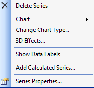
To change the Chart Type, select ‘Change Chart Type…’
For the secondary vertical axis, select ‘Series Properties…’
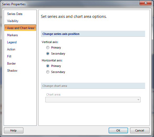
Then select ‘Axes and Chart Area’ in the left window, then select the Secondary radio button under ‘Change series axis position’.