
Liferay DXP 7.1 and 7.2 comes with a powerful new feature called Page Fragments. Page Fragments allow you to embed a grouping of content on a directly editable Content Page. A Page Fragment is a re-usable section or component that can contain an arrangement of various kinds of content. Changing text in a page fragment is reasonably straightforward. All you have to do is go into edit mode, click on the text, and start typing, much like how you would edit text using a word processor. When editing text on a page fragment, you see the changes with the actual color and font that the end-users will see– as you are typing it, in real-time.
This is in contrast to the more traditional web content– with Liferay web content, you edit text and other fields in a form, and only after you submit the form will you see the changes reflected. The problem with a form is that it can take you out of context. You are not quite fully sure what it will look like until you get out of the form and go back to the page.
If you are not yet familiar with Liferay page fragments, you should review the documentation starting here:
https://portal.liferay.dev/docs/7-2/user/-/knowledge_base/u/creating-content-pages,
And here:
https://portal.liferay.dev/docs/7-2/frameworks/-/knowledge_base/f/page-fragments
You can learn about the different tags you can add to a page fragment here:
https://portal.liferay.dev/docs/7-2/reference/-/knowledge_base/r/fragment-specific-tags
There is also a Page Fragment Development Guide:
https://help.liferay.com/hc/en-us/articles/360028726832-Page-Fragments
Page Fragments are a welcome innovation, taking the idea of a CMS to the next level, but they do have some limits.
- Page Fragments are instances. If you have a fragment used on two different pages, and you edit the content of one of them, the changes will only be reflected on that page. The other page will be unchanged. If you need to rebuild a page for whatever reason, it can be tedious to re-create all the instances of your fragments with the right content. This is in contrast to web content. A change to web content will be across the entire site, potentially multiple pages.
- Page Fragments can embed only some kinds of content. Most notably, they can include text, images, basic links, web content, and asset publishers (formerly known as ADTs). Fragments can NOT contain other fragments, so they cannot be used to build custom layouts, for example.
- Page Fragments have extremely limited ability to do instance-level configuration. You can edit the CSS/HTML of a fragment, but that affects ALL instances of a fragment. If you just want to, say, configure the background of a particular instance of a fragment, but leave the other instances of that fragment alone, you are out of luck.
One solution to the third limitation is to just have lots of different page fragments, each one with the instance configuration that you want. And, in fact, this is how I started off at first. For example a Red Card fragment, a Blue Card fragment, and so on. But that can get tedious. What if you also want to configure the foreground color? Or dimensions? Or something else? This problem led me to explore how page fragments could be customized on an instance level, and I think I came up with a pretty interesting solution: leveraging the power of embedded web content to do the work of configuring the page fragment.
The Challenge
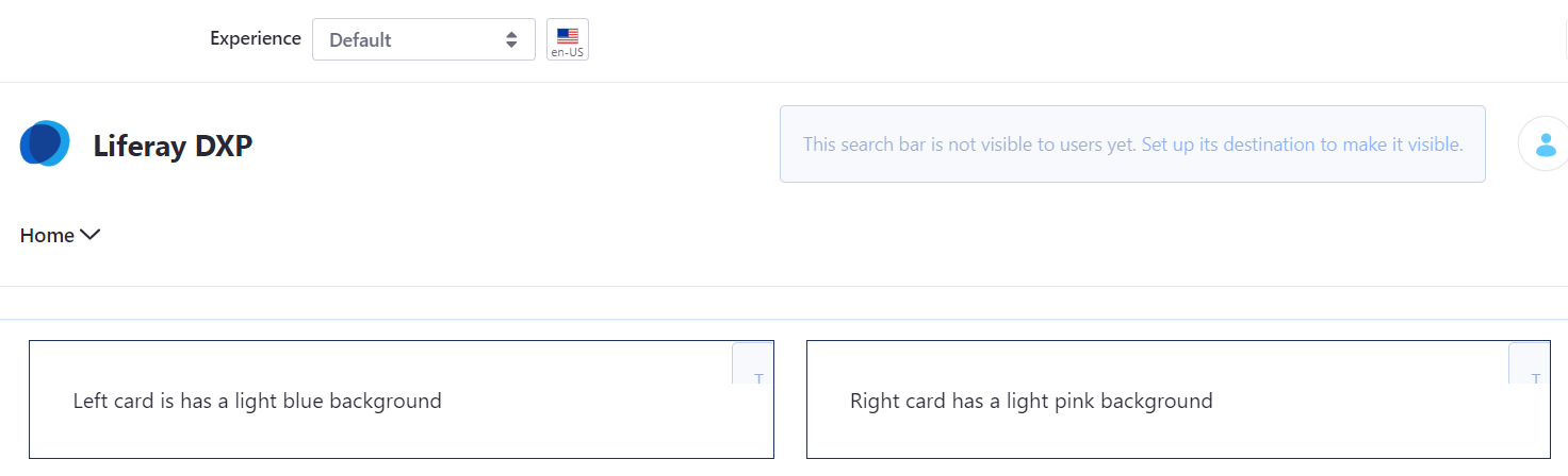
Let’s say I have two instances of the same fragment called My Card on a content page:
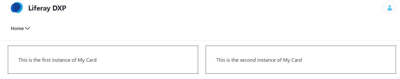
I want to make the background of one of the cards light blue and the other light pink. How can I do this?
Implementation
First, I need to add some markup to the My Card page fragment component:
<div class="my-card-component">
  <div class="fragment-configuration">
    <lfr-widget-web-content id="fragmentconfiguration"></lfr-widget-web-content>
  </div>

  <lfr-editable id="heading" type="rich-text">
    This text is styled, so it will look pretty!
  </lfr-editable>
</div>
We need to hide this configuration div when we are viewing the card and have it shown when we are editing this card. Furthermore, we want to position this configuration div in the upper right corner so it doesn’t affect the rest of the layout or get in the way. This style can go in the page fragment or in your theme:
.my-card-component {
  border: 1px solid currentColor;
  padding: 2rem;
  position: relative;
}

.fragment-configuration {
  display: none;
  position: absolute;
  top: 0;
  right: 0;
  width: 2rem;
  height: 2rem;
  overflow: hidden;
}

.controls-visible .fragment-configuration {
  display: block;
}

.fragment-configuration .portlet-header {
  top: -10px !important;
}
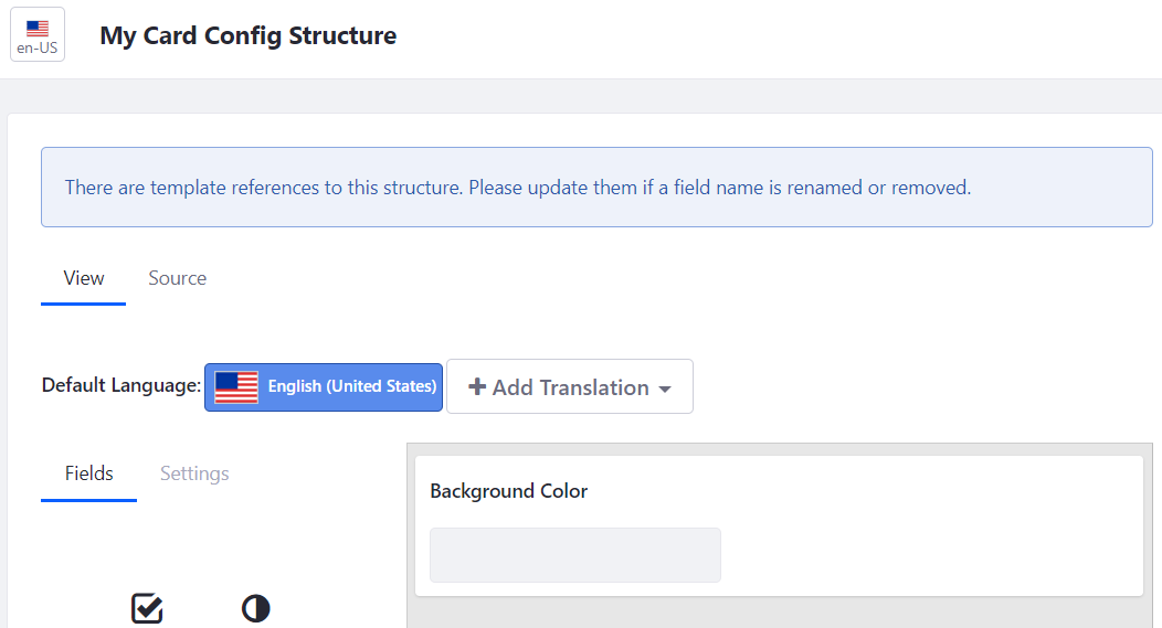
We need the structure of the My Card Config web content. In this case, it is just a simple text field:
We need the My Card Config web content template. In this case, I needed a way to uniquely identify this instance. Alternatively, to using freemarker, I probably could have used document.currentScript but that isn’t compatible with older browsers.
https://stackoverflow.com/questions/403967/how-may-i-reference-the-script-tag-that-loaded-the-currently-executing-script#22745553
<#assign uniqueId = .now?string["HHmmssSSS"]?number />

<div id="my-card-config-${uniqueId}"></div>

<#if BackgroundColor?? && BackgroundColor.getData()?? && BackgroundColor.getData() != "">
  <script>
    $(function() {
      var $myCard = $("#my-card-config-${uniqueId}").closest(".my-card-component");
      $myCard.css("background-color", "${BackgroundColor.getData()}");
    });
  </script>
</#if>
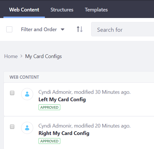
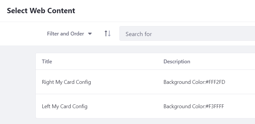
Create the left and right My Card Config web content. I keep them tidy by putting them in their own folder:
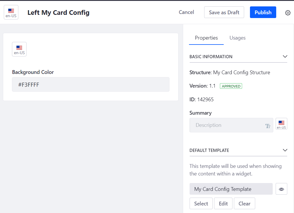
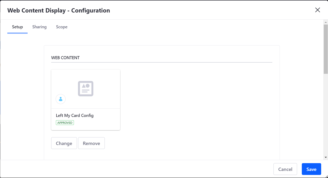
Set the web content for both fragments. Don’t forget to set the template, and publish.
On your content page, go into edit mode and hover over the upper right corner of each fragment to see the gear icon. This will allow you to set the web content:
Click the gear icon that will appear when you hover over the upper right of the fragment:
Don’t forget to save:
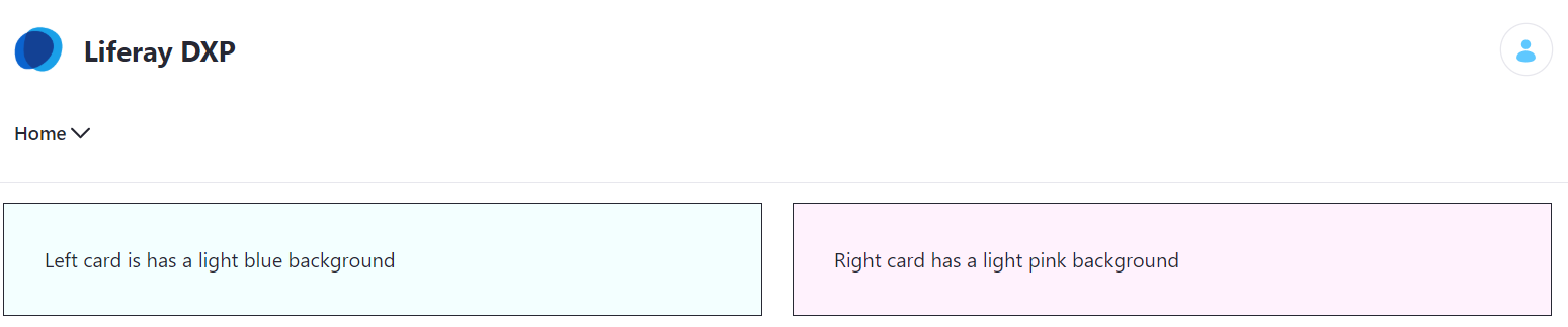
Success!
Extra Bonus
You’ll notice if you are an admin but not in edit mode, the gear icon will now be three dots, which you can use to quickly configure your fragment config web content:
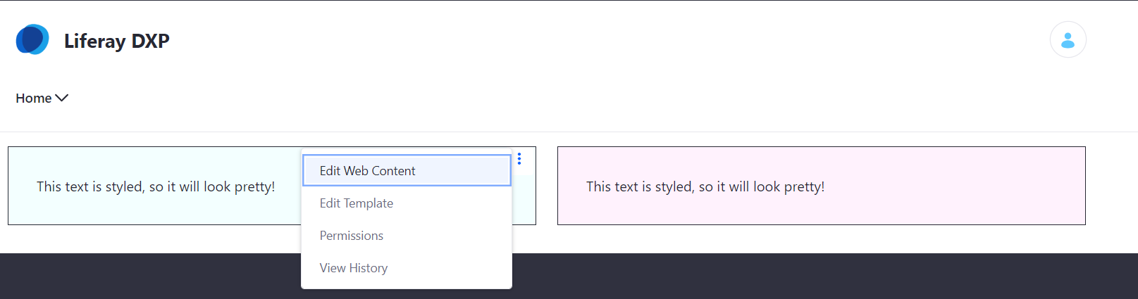
You could use this if you wanted to quickly adjust your background color, for example.
Summary
Using this pattern, you can see how we could build out the fragment configuration to set foreground color, card size, toggle scrollbar, and much, much more. One advanced technique I’ve implemented is having my configuration web content offer a choice between a custom color (like what this blog post demonstrates) and a pull-down to select from among your theme colors. But that’s a blog post for another time. Hope you enjoyed reading this, and have fun configuring your fragments! If you have any questions at all, please engage with us via comments on this blog post, or reach out to us at www.xtivia.com/contact/.