User Documentation
The user documentation consists of the following sections:
Drill-Down Configuration
There are times when you look at a chart and need a bit more detail than just the number represented by the bar or pie chart segment. With the Dashboard Framework your user can click on a chart and see the details of the particular element as a secondary chart. This secondary or drill-down chart can be an entirely different format from the primary chart.
To enable drill-down for a particular chart, open the configuration screen. At the bottom you’ll find a checkbox to enable drill-down. Once you check this box, you’ll be presented with additional options specific to the drill-down chart. These should look familiar since they are the same options you used to construct the primary chart. No filters are needed since your primary chart may already be filtered. In addition, you can check the box to display the drill-down chart in a popup window, rather than replacing the primary chart (users can return to the primary chart by using the Back button on the drill-down chart).
Let’s take a more detailed look at how we can add the drill down charts to the sample charts we configured earlier so that users can look into more details of the data shown on the charts.
The first sample chart we did was a “Units sold by channel” chart. Let’s open up the chart portlet configurations for this chart and check the checkbox in front of “Enable drill down”. The drill down chart configuration section will pop up. Choose the chart type to “Multi Series Line 2D”, the measure to “Amount Sold”, the chart category to “month” and the chart series to “customer region”. Here’s the configuration screen:
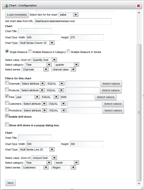
Once the settings are saved, the original chart will remain the same, but all the columns in the chart become clickable, when the user clicks the column, another chart with the monthly detailed data for that quarter will show in the same portlet window as below:
The user can click “Back” to go back to the original chart.
Sample chart 2 is “Today’s sales vs plan” chart. Let’s do the same way to enable the drill down charts for this chart. First let’s change the original chart’s settings, change the chart category from “store” to “district”, change the chart’s width to 1000 and then change the preset filter to “Region No. 6”, then save the settings. Now the original chart becomes:
Now open up the chart portlet configurations for this chart and check the checkbox in front of “Enable drill down” and also check the checkbox in front of “Show drill down in a popup dialog box”. In the drill down chart configuration section we set the chart width to 1100, the chart height to 400 and choose the chart type to “Pie 3D”, the chart category to “store”. Here’s the configuration screen:
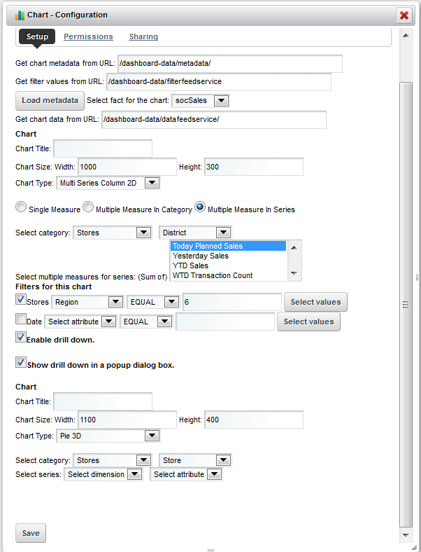
After the settings are saved, when the user clicks any columns in the original chart, a detailed pie chart will show in a pop up dialog box with the detailed data for all the stores within the district of the clicked column.